Research suggests that consumers make most purchase decisions for consumer packaged goods while they’re out shopping. Imagine customers viewing similar products from various brands on store shelves or in an eCommerce shop. Brand packaging that attracts attention and engages interest can significantly influence shopping choices.
Customers can’t open boxes, bottles, and jars in the store before purchasing and certainly can’t open online purchases. At the same time, most shoppers arrive with set preferences and tastes, and they need to rely on labels, descriptions, and branding to figure out if one item or another will satisfy them after they get home. After all, most people don’t spend that much time researching products like yogurt, lotion, or snack bars before they shop.
A product’s packaging needs to catch a customer’s eye and make a good impression. Brands need to rely on their packaging to tell their stories. The text, logos, and other graphics must do an excellent job of differentiating themselves from alternative options. Find out how brand packaging can influence purchase decisions and explore some real-world package redesigns that had a significant impact on sales.
How much does brand packaging influence buying choices?
For instance, a scholarly article in the National Journal of Medicine discussed packaging design for cosmetics products. The authors found that consumers made 73 percent of their buying choices at the point of sale. The researchers concluded that the shoppers’ perception of the product and the entire brand’s value begins with attractive packaging.
An excellent package design can benefit consumers and companies by easing the shopping decision by helping the well-packaged product stand out in a crowd of choices. Elements of using packaging to develop and reintroduce a positive brand identity can include colors, shapes, quality, materials, and convenience.
Companies invest a lot in developing products that suit customer preferences. For example, cosmetics consumers enjoy attractive packaging that reflects their lifestyles and tastes. Successful brands take time to learn about their target audience and design packaging to please customers.
Packaging serves as a “salesperson on a shelf”
For instance, these shoppers will want to ensure the packaging makes dispensing easy, protects the product, and offers a sustainable, eco-friendly alternative. In a typical consumer’s mind, packaging can add to or detract from the quality and value of the product.
These factors often combine as a first source of the customer’s perception of the brand’s identity. The researchers referred to packaging as a salesperson on a shelf. If brands want to profit from a 24-7 remote and unsupervised salesperson, the packaging must support and communicate their brand message.
Examples of packaging changes to support a positive brand identity
Since packaging’s first job involves engaging the shopper’s attention, it helps to parse out visual elements of recent package design changes. Many companies have boosted sales after learning more about their target audience. This understanding offered them insights to introduce packaging improvements. To understand how these improvements helped attract customers, consider some examples.
Chobani
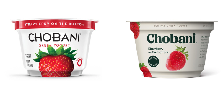
Chobani redesigned its packaging a few years ago. Find the old version on the left and the new one on the right. When the company changed its packaging, it had already produced yogurt for over a decade. Chobani had also beaten the competition to become the best-selling brand in the country. The redesign surprised some observers who associate packaging changes with businesses that struggle and not those that already lead their fields.
The company’s chief creative officer, Leland Maschmeyer, responded that they didn’t want to wait for a problem that would force them to rush into making impulsive choices. He also said that the company’s leadership position gave them more confidence to make calculated moves to help position the brand for future growth.
Chobani had learned more about the changing tastes of yogurt buyers and wanted to ensure that their packaging reflected it. He added that rebranding during a downturn might communicate weakness rather than innovation.
At first glance, the new design appears more straightforward than the old one. Mr. Maschmeyer said this design choice reflected the brand’s transparency and natural, whole-food, simple ingredients.
The Packaging Lab also reported on psychological studies that help explain how other elements of the changes supported the idea of a natural, simple product:
- In places where people read their language from left to right, shoppers prefer reading the details on the left side of an image. The new package moved most of the text to the left side instead of centering it on top of the strawberry.
- The company also changed to a bolder and simpler font, replacing the fancier script. A plainer font can also help communicate a more natural and simple image.
- Chobani left the basic color scheme the same as customers probably already unconsciously associated these shades with the brand. At the same time, the new design appears less complex and cluttered.
- Instead of just one extremely bright, oversized strawberry, multiple realistic berries adorn the label, signaling natural abundance.
RxBar
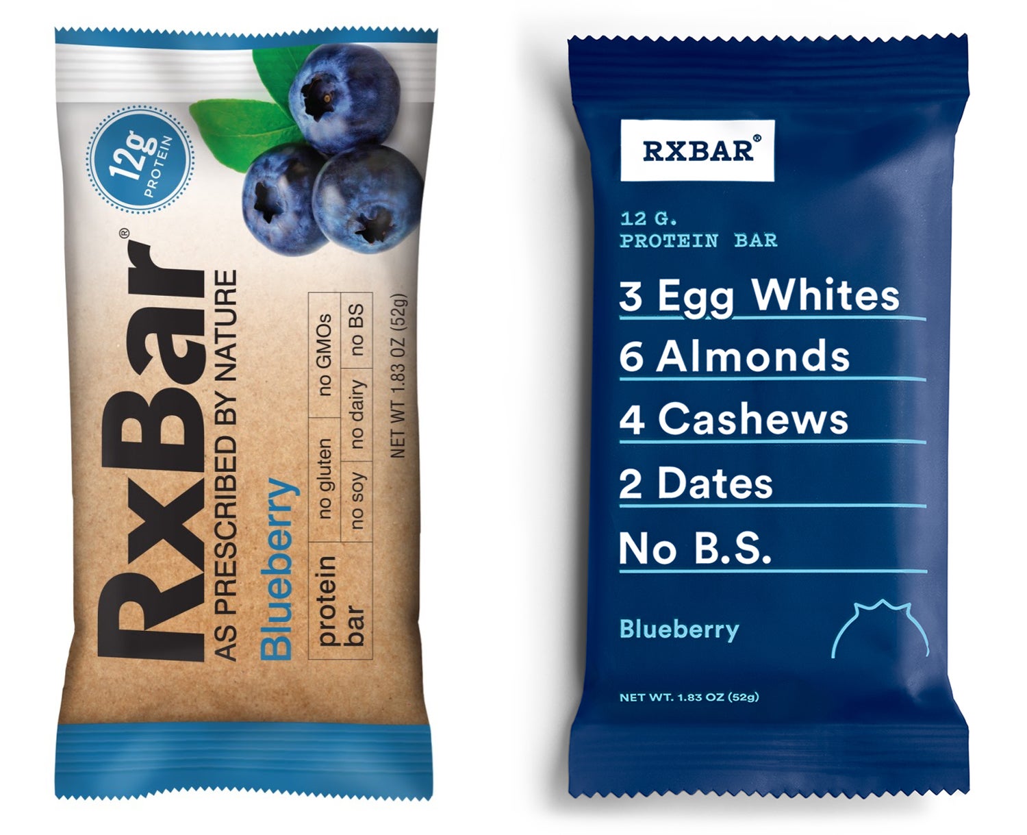
In contrast to Chobani, RxBar floundered in relative obscurity before redesigning its packaging about five years ago. Peter Rahal and Jarred Smith founded the company. These two partners designed the original packaging on the left in PowerPoint by themselves just before they launched RxBar in 2013.
At first glance, the design appears adequate. However, it didn’t do much to differentiate RxBars from its competitors. For instance:
- Consumers can find plenty of protein bars at grocery and convenience stores, most of which look similar. Rahal and Smith probably gained their initial inspiration from products they had seen on store shelves.
- Most snack bars, even supposedly healthy ones, look like candy bars in the package. Some snack bars also resemble candy more than healthy snacks after reading the ingredients. Thus, consumers might not know the difference between healthy snacks and candy bars full of processed ingredients, fat, and sugar.
After a few years, the founders realized that most sales the brand had achieved previously came from word-of-mouth emphasis on RxBar’s natural, whole ingredients. They listed the ingredients on the back of the bar, but most people didn’t bother to turn the package over to read them. The company’s founders grew convinced that promoting these real-food, recognizable ingredients would give them a competitive advantage over highly processed competitors.
After achieving stability a couple of years after launching, the pair consulted with a packaging design company to help them rebrand. Thus, RxBar’s new packaging lists the simple, healthy ingredients in bold letters on the front. The redesign also changed the large photo representing the bar’s flavor to a smaller and more modern graphic image. In addition, the company shrunk the logo, figuring the basic but distinctive style of their packaging would offer plenty of branding.
Despite some concerns from consultants about making the package look generic, the founder’s ideas worked. RxBar’s packaging won design awards, and the company soon had contracts with major retailers like Trader Joe’s and Whole Foods. RxBar may have violated plenty of traditional packaging design rules. However, they conveyed their most important message to distributors, retailers, and consumers.
Luma & Leaf
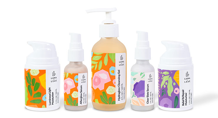
Luma & Leaf serves the growing market of younger adults who prefer organic skincare products. Bigeye took on the project to revamp the company’s branding while maintaining the company’s playful voice.
Bigeye took the time to understand Luma & Leaf’s business goals and target market. For example:
- The designers understood the client’s core belief that everybody deserves products that help them look and feel their best without adding unnecessary stress.
- They also knew the audience preferred natural, sustainable products that offered convenience and a pleasant appearance.
Skincare product companies must stand out in a highly competitive market. Thus, Bigeye wanted to ensure that the packaging communicated Luma & Leaf’s competitive differentiator in a prominent yet attractive way. Various patterns represent collections within the company’s brand architecture, including Clearing, Soothing, and Illuminating. Each distinctive pattern showcases the natural, plant-based ingredients used to make the product.
Organic ingredients and sustainable packaging support healthy skin and a healthy environment. The company’s customers care about using natural products on their own bodies. These consumers also express concerns about the environment. In addition to making skincare products with sustainable ingredients, Luma & Leaf also offers upcyclable packaging that customers can use for plant misters, bud vases, and more.
The messaging paid off. When Luma & Leaf launched the newly designed products on the company’s eCommerce site, they generated thousands of dollars worth of sales within days. Learn more about Bigeye’s packaging design work with Luma & Leaf on the case study page.
Is it time for a better packaging design?
Instead of struggling for a few years like RxBar, startups can encourage faster growth by studying their market and designing packaging that offers more value to themselves and their customers. Similarly, established businesses might consider a revamp to meet new trends or reenergize sluggish sales.
At Bigeye, we’re always eager to listen to your company story and help you communicate it to more customers. Contact us today to get started.