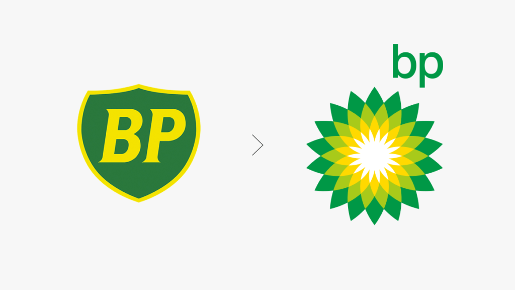
When thinking about how to make a logo that actually works, one of the most obvious answers is to take notes from the pros. The most expensive logo created in the last decade was gasoline giant British Petroleum’s – also known as BP – logo refresh in 2008. The company partnered with a marketing agency (read: paid them $211 million) to create a new logo in a highly saturated, mature market. The goal was to design something that symbolized the potential of gasoline, BP’s emphasis on green technology, and that helped them stand out from their major competitors such as Exxon and Chevron. The results transformed BP’s traditional green and yellow shield into a starburst, with an updated modern font. Seems simple, right? So why was this fresh design worth $211 million, and how can you make a logo that charges your brand with the same effect? We’re glad you asked.
Why are logos worth so much to your organization?
BP isn’t the only company that has invested heavily in logo design. Up and coming organizations or companies trying to refresh their image, such as Pepsi or Accenture, have been known to spend over a million dollars on logo designs as well. Yet, some of the most well known logos, such as Google and Twitter, were designed for less than $15. So, do you need to spend a million to make a million from your logo? We’re going to let you in on a secret: the answer is no. Highly recognizable companies such as Coca-Cola and Nike went through the same logo design process that we recommend to our clients, and now include their logos on their accounting financial statements as “goodwill” assets that are routinely represented in the billions – that’s a b – of dollars because they are so valuable.
The trick is realizing that it isn’t how much you spend on a logo, but how effective it is and how well it complements your brand, that makes a logo valuable. Logos are, quite literally, the face of your company, so they become your most valuable hook when catching your customers’ eyes. BP, Coca-Cola, Google, and Twitter all have easily identifiable logos — so recognizable, in fact, that many consumers can identify these brands with simply their colors alone. If you ask your local Orlando marketing agency representatives how to design a logo that is worth millions, the answer is simply to make sure it’s something people will remember. Logos become an asset to your brand when they trigger continuous, top of mind cognizance about your product or are so recognizable in your category that your customers always think of you before your competition.
How to make a logo that works for your brand.
There is no exact “How to Make a Logo That Works” guide (although we wish there was), but there are a few tried and tested rules that can guide your logo design toward success. Taking a page out of Google’s playbook: logo creation doesn’t need to be expensive, but it does need to be effective, which is why we recommend partnering with a local Orlando marketing agency to craft something that will speak to your target audience and adhere to design best practices.
1. Avoid cliches:
We know it can be tempting to use that ultra trendy free font you keep seeing around town, or purchase stock images from the web for your logo because they’re “in” right now, but don’t. Choose a symbol, an image, or font type that is uniquely you. If you are able to find the main image for your logo on Google, your customers will be able to find it too. Certain imagery – such as the infinity symbol, foliage, clasped hands, and globes – may seem like they speak to your brand in a meaningful way, but are so common and overused in the general marketplace that your logo has no chance of hitting that $211 million mark.
2. Typography can be a logo:
Also realize that sometimes a picture isn’t worth a thousand words. We don’t say this often, but you don’t always need an image for your logo. Custom fonts and artistic lettering can be a logo in and of itself. If you’re unsure how to make a logo that will resonate with your customers, the best place to start is often your company name. A marketing agency can help mock up a variety of lettering treatments that capture the tone and vibe of your brand. A clean, text-based logo will help your customers focus on who you are or the services you offer without leaning on cliche images or rolling the dice with abstract artwork a la Nike’s signature swoosh.
3. Keep it simple:
The most important thing you can do when creating a logo is to keep it simple. Once you create a design, do the “three second test.” Show your logo to a few friends or colleagues for three seconds, then ask them what they remember about the logo and how it makes them feel. If your logo is too complicated, they may have trouble answering that question clearly, so use their responses to guide any tweaks, simplification, or updates to your design. Color, type face, and images all play a part in crafting the perfect first impression, so don’t be afraid to try a few variations until you discover what works.
No matter what image or font you choose to represent your company, your logo should be something you love. Remember, your logo often serves as the cornerstone of your brand and can be the starting point for your brand and design guidelines or creative expression. It is a jumping off point for your other marketing initiatives, so don’t rush this critical part of the brand building process. Working with client partners like you has helped us learn how to make a logo that works. Learn more about our clients and past experiences building a brand around innovative logo design. Will your name and logo become the next Google or Nike? We want to help you find out.