If you think you’ve seen every blog post about website color schemes already … think again. Most posts about website color schemes showcase lists of the best website color combinations on the market. They pop with energy and elegance. You might even feel a little design envy while skimming these sites’ perfectly balanced photography, high quality imagery, and tasteful color palettes. But, let’s be honest: most of these blogs don’t tell you how to make your site look that good. Sure, we’re proud of our work. And if you want to see some examples of how we’ve helped clients use color theory to amp up their businesses, click here. But we also want to give you the tools you need to start (color) scheming like a pro. Below, we’ll walk you through the guiding principles of color theory to help you create effective website color schemes that you can start using today.
Creating effective website color schemes isn’t as hard as you think once you understand a few essential principles of color theory. Some of the basics, you probably already know from days in your middle school art class (like how primary and secondary colors are positioned on the color wheel, or mix to make new colors). And some color theory boils down to intuition based on your own taste and preferences. Remember, it’s your brand. There’s no formula that generates perfect website color schemes every time, so sometimes it’s good to trust your gut and simply go with what looks good to you. That said, these principles will help you along the way.
SET THE TONE WITH YOUR MAIN COLOR:
The most important decision you need to make is choosing your main color. A little color psychology (and some common sense) can help you here. Colors tend to channel tones and emotions that subconsciously prime your audience to feel certain emotions. Red signals urgency and energy. Green resonates freshness, nature, and cleanliness. Blue has a calming and trustworthy undertone. Yellow can bring elements of levity and lightheartedness to your brand. These descriptions should feel like common sense to you because we have all been primed to feel these associations based on a variety of environmental and cultural cues that link color with emotion. It makes sense for a sporting goods store to use an energetic color such as red and orange, or an earthy earth tone such as brown or rust for a main color because there is a natural link between these colors and the outdoors … but can you imagine that same brand choosing a soft purple or hot pink as a primary color? We agree: it’s a stretch.
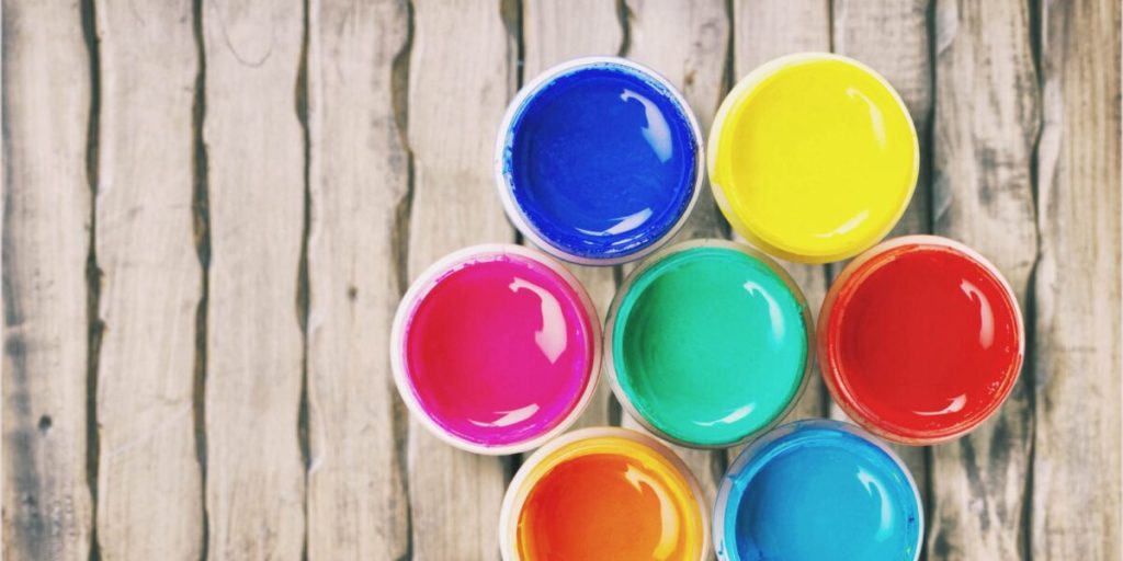
Think about your own brand and the emotions you want to link with it. Jot those feelings and associations down, then cross reference them with your primary colors. Now, you’re off to a great start. If you get stuck, we recommend choosing an image (whether it’s your logo, a picture of your headquarters or office, your products, or even something that just speaks to your brand) and brainstorming what colors stand out to you. This can help you break free of the norm if you feel like your primary color is too trite or a little overplayed. For example, a surf shop owner may choose a picture of the beach when thinking about her brand, but feel drawn to a burst of magenta shrubs in the corner of the frame. Unlike the expected blue or teal, the magenta adds an element of excitement and adventure that might just be the color her brand needed.
CHOOSE SUPPORTING COLORS, AKA UNDERSTANDING COMPLEMENTATION:
Next, invite some friends. Complementation refers to how well colors mingle with other colors. Hues that are across the color wheel from each other tend to be visually pleasing because they create a natural visual balance by complementing each other. As you think about additional colors that will support your signature tone, consider how well they work together. Make sure you have at least one additional color that creates real contrast when layering colored text or grabbing your viewers’ attention. Most supporting color choices fall into one of four types of website color schemes:
Complementary
Your brand colors should play off each other, rather than conflict with each other, which is why complementary website color schemes are one of the most popular choices. Start with your main color, then look across the color wheel to see what its opposite is. This tone will stand out when placed near your main color without competing or creating visual friction.
Monochromatic
If your complementary color is too bold for your brand, you may consider dabbling in monochromatic color schemes. Instead of choosing additional colors, you use different tones or shades of your main color. This creates a sense of visual consistency and uniformity that can be very aesthetically pleasing. Just make sure your colors are not so similar that you lose your visual dynamics. To do this, experiment with the saturation, tone, and warmth of your main color.
Analogous
A variation on this idea is analogous website color schemes. Typically, they feature three to four colors adjacent to your main color on the color wheel. Like monochromatic schemes, this option creates a visual consistency that can boost familiarity with your creative elements; however, analogous colors provide a little more variety and interest on your website. This is especially useful to mitigate the negative impact screen size, brightness, HD display styles, and other outside factors can sometimes have on monochromatic color palettes.
Triadic
In recent years, triadic website color schemes have become wildly popular. Start by drawing an equilateral triangle from your primary color on the color wheel. The two opposite points of your triangle (and their neighbors) represent unique color complements that are visually intriguing, but not as starkly contrasted as your primary color’s main opposite. Triadic colors give you a little more flexibility if you want to use several colors for your brand without the risk of overwhelming your viewer.
When in doubt (or when you’re ready to take your website color schemes to the advanced level), our team can help educate and assist you in choosing your color palette — but remember, the best website color schemes come from your heart.