Even as an experienced brand marketing agency, we still suffer from nightmares of designing a logo so scary that it frightens away customers. Still, we make it a habit to study both wizards and trolls in order to benefit from experience and broaden our perspective.

In the spirit of the Halloween season, we like to have a little fun looking at some gruesome logo mistakes. At the same time, we’re engaged in the very serious business of helping our clients build their brands.
Frightful logo mistakes
Learn from these horror stories of bad logos to avoid summoning any monstrous creations.
Pre-2015 Verizon
John McWade of Design Talk commented on Verizon’s 2010 logo by saying it contained one checkmark too many.
Less generous designers called it the “all-time worst logo” because of that same oversized checkmark that Mr. McWade commented on. The checkmark distracted attention from the brand and gave it an unwieldy shape.
In 2015, Verizon made the wise decision to release a new logo, developed by Pentagram, a design powerhouse. The redesign reduced the size of the checkmark and moved it to the right of the company name, making the overall graphic less awkward.
Short-lived 2010 Gap logo
In October of 2010, Gap replaced the well-known blue square with their brand inside with a logo that emphasized the brand name and had a small, blue spare intersecting GAP’s P. Customers hated it so much that the brand rapidly reverted to the original version within two weeks.
Gap learned that customers cared more about the brand’s image than even the company imagined. It’s a scary lesson, but at least the company learned that their customers felt invested. In 2016, they kept the brand in the logo, but they took away the blue square without facing backlash. This story emphasizes the importance of crowdsourcing opinions about a brand redesign for an established company.
NYC Taxi logo
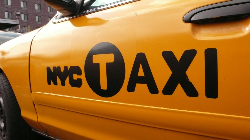
Some reviewers of the NYC Taxi logo’s redesign called it a “Frankenstein,” so it certainly fits in well with a list of monstrous redesigns. The MTA isolated the T in TAXI and enclosed it in a black circle, surrounded by NYC on the left and “AXI” on the right.
They actually based the redesign upon a logical desire to avoid confusing the taxis with a subway route designated by a T. The problem centers on people’s first question when they see the new logo: “What is an AXI?”
2016 Uber logo
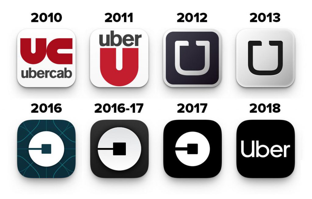
In 2016, Uber’s new logo replaced the “U” for Uber with a character that looks like the mirror image of a C. The company called it a bit, and maybe they meant to represent the digital nature of their business. In time, they prudently reanimated their logo by using their brand’s wordmark.
2012 London Olympic Games
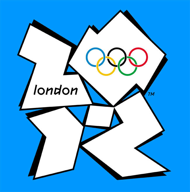
Host countries create logos to help represent their game’s unique brand identity. In the best cases, the logo represents both the games and the host city. The jarring image from London in 2012 looked more like a psychedelic trip to Berkeley in 1968.
They meant to produce a hip, modern image, but it simply looks jarring and out of place. The design appears chaotic, it doesn’t represent London well, and apparently, almost 50,000 London residents signed a petition to have it changed.
Design rules to keep logo redesigns from turning into slasher movies
As an experienced brand identity agency, we follow some simple rules to develop logos that offer our clients treats and no tricks. We know businesses seek us out to enforce a positive brand identity and not to frighten off customers or generate poor press. In particular, no company wants to invest in a new logo only to have to reanimate their old logo after several days, as Gap did in 2010.
With these rules in mind, avoid generating frightful logos:
- People should see the logo and immediately understand what it represents.
- Simple designs avoid distractions and help clarify the message.
- Avoid awkward designs that make it difficult to place the logo on various media, like banners, packages, and business cards.
- Use relevant and instantly recognizable symbols.
- Look at other company’s logos to understand why they work or why they failed, but don’t copy them. Businesses need to build a strong brand identity and never have their logo confused with the branding of another company.
Established companies might also consider passing design ideas by a crowdsourced group of loyal customers. New brands can set up survey groups in their target market to find out how their future customers will react. As an Orlando marketing agency, we know that customers might not always be right, but what they think always matters.