To engage the notoriously short attention span of internet users, even older brands have recently introduced modern, streamlined versions of earlier logos. Flat logo design refers to the popular trend of using two-dimensional, two-color branding images that don’t contain realistic images, shading, and other enhancements. They’re meant to appeal to contemporary consumers and easily transfer to various media, packaging, and products.
Certainly, many new or established brands can benefit from cleaner and more practical graphics. On the other hand, it’s easy to find examples of companies taking minimalism too far. This results in colors and graphics that closely resemble other products or brands or fail to reinforce the company’s image in other ways.
Find out more about the benefits of flat logo designs and hopefully, how to avoid some common pitfalls.
Why have brands turn to flat logo design?
The image in this section compares Apple’s original logo with the current one. Actually, there’s a lot to like about Apple’s original logo. It tells an entire story about Isaac Newton getting hit on the head by an apple and noticing gravity. It probably strikes most contemporary people as nostalgic and almost like something to expect on a craft beer or wine label.
That image probably represented the budding startup well at the time. In those days, Apple may have told their branding agency that they wanted the logo to send a message that they had better ideas, genius designers, and high standards of craftsmanship. No doubt, the original logo communicated a lot of information. It’s also obviously the opposite of a flat design.
These days, Apple wants to portray a somewhat different image to an evolving marketplace. Even though the original graphic tells a story, it contains so many details and graphical enhancements that it looks even more old-fashioned than it even is. Today, Apple strives to position themselves as the cutting-edge tech company for smart and savvy customers. Since they’ve established their brand so well by this time, they don’t need to use their logo to tell so much of their story.
Besides, Apple can now enjoy the benefits of a minimalist design that they can easily use as a package label, product logo, or cell phone icon. Most of all, few people remember that old, nostalgic Apple label, but almost everybody recognizes their current brand image. This design change worked, though it’s fair to say that the old one looks sort of cool.
Do contemporary, flat logo designs always work well?
Creative Bloq nailed the problem with today’s minimalist logo design trend. In theory, flat designs should reduce cognitive load by displaying a simple image to represent a brand. However, so many of these new graphics rely on similar shapes and color schemes that it might actually take more mental effort than ever before to tell them apart. In that way, they can actually increase cognitive load.
New vs. Old Product Logo Comparisons
For instance, look at the comparison of Google’s previous icons on the top row and the current versions on the bottom row. As just one example, it’s fair to argue that the top mail icon more clearly tells typical Gmail users that this image offers a portal to their email inbox than the stylized “M” below it.
Plenty of users say the same thing about the document and video image comparisons. In fact, the images on the bottom row tend to look so much alike that it takes more thought to tell them apart than it did before. For a company that prides itself on its focus on usability, the icon redesign doesn’t appear to achieve its set goal. It’s so stylized that it fails to communicate well.
Brand Logo Comparisons
Possibly even worse than giving users minor problems with distinguishing between products from the same company, some brands have begun to mimic each other so closely that they’ve grown way too hard to distinguish.
The logo for a UK bank called Monzo has a stylized M, and sometimes they use only the M without the bank name below it. Refer back up to Google’s new email icon to see how similar the graphics would look as app icons on a smartphone or labels on a box. They’re different, but they would still be easy to mistake for each other because of the closely matched font style and colors.
Examples of Successful Logo Redesigns
Some clever logo designers have introduced graphic redesigns that both creative agencies and customers appreciate. As examples, consider the good choices made by Burger King and Adobe.
Burger King’s New Logo
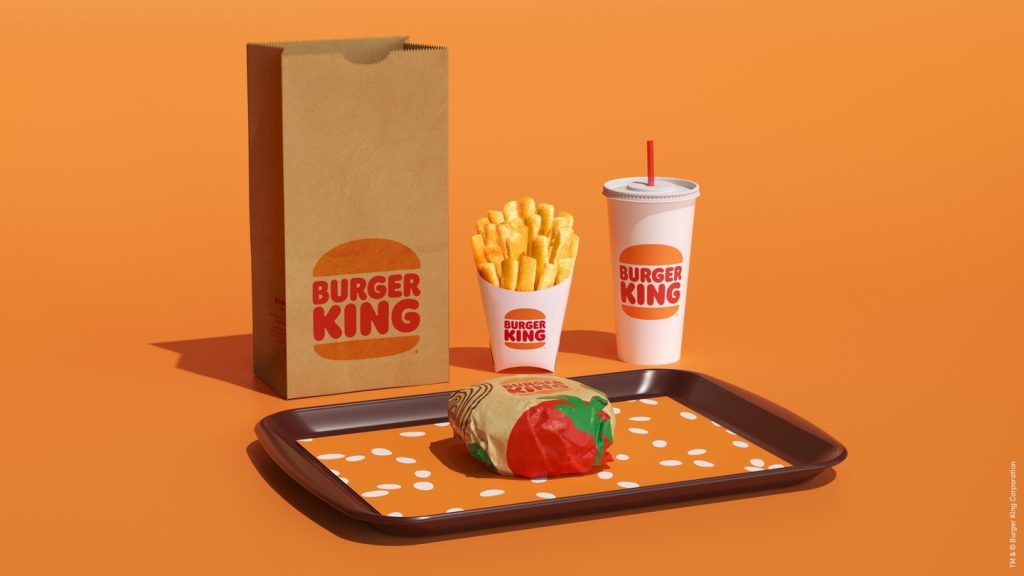
As one winning example, look at Burger King’s redesign. Notice that the current logo on the right side of the image actually looks more like an earlier graphic than the more stylized version that immediately proceeded it.
For one thing, Burger King reverted away from the stylized and perhaps unclear image of a hamburger bun. For another, they removed the blue crescent to simplify their color scheme and reduce the amount of details. According to Lisa Smith, a creative director at Burger King’s logo design agency, they wanted to pay homage to the company’s history but produce a more refined version of it.
Perhaps less obvious, they also hoped that taking away the blue crescent would help symbolize the brand’s removal of artificial colors and ingredients from their recipes. Either way, the new logo should not confuse anybody who wants to find a burger from the established fast food chain, and nobody would think Burger King looks like McDonald’s.
Adobe’s Logo Redesign
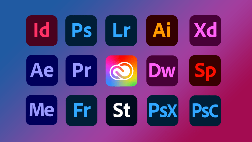
Adobe also removed one color in their transition from an old to a new logo. According to the Adobe Blog, the company wanted to make their new design more functional across a range of different surfaces and product types.
Besides their brand logo, they also introduced new product logos with stylized images of two- and three-letter mnemonics to help customers easily find the products they want. As an example, Ps stands for Adobe Photoshop, and PsC stands for Adobe Photoshop Camera.
With a focus on usability and attention to choosing colors for accessibility, they made graphical changes that not only should enhance their brand but also improve functionality.
How an Experienced Branding Agency Approaches Logo Design
For logo design or even redesign, it takes more than just a typical graphic design agency. It takes a good branding agency that’s willing to understand the company’s audience, message, and even its history. While prudent designers will pay attention to trends, they never want to produce work that’s so trendy that it mimics other players or loses its purpose in the process.
With that in mind, business logo designers should always adhere to these best practices:
- Conduct brand discovery and market research first: As in the case of Burger King and to some degree, even Apple, the best logos can look very contemporary without sacrificing a nod to the past. Also, invest in enough research to ensure the audience will respond well to the new logos. It’s better to hear this kind of criticism from a focus group than to see it on Twitter.
- Note current trends without blindly following them: Changing a logo carries some risk, especially for a business that already has significant brand and logo recognition. Flat and minimalist designs offer plenty of benefits; however, don’t sacrifice functionality and uniqueness.
- Avoid out-of-the-box typography and color pallettes: Very often, even simple typography customization can help avoid accidental similarities between one brand and another. For instance, choosing either different colors or another font could have kept the Monzo logo from looking quite so much like Gmail’s.
- Shy away from image clichés: Sure, the new Apple logo looks a lot like the old graphics for Apple Records, but thankfully, most Apple buyers probably aren’t old enough to remember the old Beatles label. Anyway, Apple got away with it, but using common shapes, like globes, light bulbs, or apples, risks confusion and can even appear stale. If it’s necessary to use a common or generic shape, try to customize it in a unique way.
- Avoid making logos too abstract: In Google’s effort to simplify icons, they took away the instant recognition of what the images represented.
- Strive for simplicity: Complex logos may present problems when displayed on different devices or surfaces. That’s also why sticking with two colors makes logo designs more practical for a variety of applications. Using just one or two colors can also open up the possibility of reproducing it in monochrome if the need arises, say for stationary or business cards.
- Develop responsive logos: Logos shown as icons for apps, emblems on products and packaging, and advertisements on TV or computers will need to scale to various sizes. If it’s not possible to design one responsive logo, consider creating variations for different applications.
- Develop brand guidelines: Finally, businesses should protect the investment they make in developing and promoting their brands by publishing guidelines that specify how to use the logo. Some guideline considerations might include permitted and prohibited uses, fonts, colors, and padding.
Developing a Logo that will Last for Generations
Businesses invest a lot in creating a brand identity, and a logo represents a visual cue or reminder of that. While brands may have good reasons to develop new logos or redevelop old ones, no business wants to do that very often. Nobody can say for sure if today’s graphics will look dated in 20 or 30 years; however, it’s helpful to look back on logos from the past to see how well they stood the test of time.
As a branding firm in Florida, Bigeye has helped established branding and designed innovative logos for dozens of growing and established organizations. Take a look at the online portfolio to find a graphic design agency that builds brands.