The science of colors in branding has long been up for debate. Many academics insist color affinity is born from personal experience, background, and individual preference rather than proven branding or marketing psychology. Yet, according to ColorCom, up to 92.6% of peoples’ perception about a brand relates to their feelings about that logo’s colors. And 80% of brand recognition relies on color association according to the blog Color Matters. Although the reason “why,” may be unclear, it is clear that brand color schemes can profoundly influence your target audience’s ability to remember and relate to your product. Our breakdown of the rainbow reveals what your brand color schemes say about you and your organization.
Red
Netflix. Target. CNN. EXXON. Coca-Cola. Time. These brands’ logos are dominated by a bold, bright red. At the very top of the rainbow and one of three primary colors, red channels a vivacious energy, and frank, action-oriented vibe. Many branding psychologists believe the color red inspires action by creating a sense of urgency and importance. For lifestyle brands such as Target or Coca-Cola, red translates to a desire to consume, while media channels such as Time, Netflix or CNN, benefit from the color’s bias toward action.
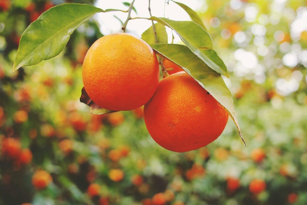
Orange
Orange is one of the less popular colors in branding and brand design. The color is more frequently used as a highlight rather than a dominant marketing campaign color. We most often see orange on “try,” or “buy,” buttons, and other calls to action thanks to the color’s warm, inviting tone (just begging to be clicked). However, many psychologists believe orange carries some of the anxiety-laden undertones found in yellow, and may serve as a better caution or warning sign than as a conversion catalyst. Organizations associated with a degree of ruggedness, such as Harley Davidson or Home Depot, benefit most from this duel psychological profile. However, more cheerful brands, such as Blogger and Nickelodeon, can also leverage the sunny hue’s tendency to inspire happiness and warmth.
Yellow
Because yellow is one of the easiest colors for the eye to distinguish (which is why many fire trucks and ambulances are yellow), brands use this color to grab consumers’ attention. The color itself has duel associations: some schools of thought align yellow with feelings of warmth and happiness, while other brand design experts associate yellow with anxiety and stress, due to the strain it puts on the eye. A wide variety of brands – from Hertz and Yellow Pages to Best Buy and IKEA – rely on the color’s bright “look at me” vibe to drive an unforgettable, top-of-mind reference in their respective industries.
Green
Depending on the tone, green works as a jack-of-all-trades. It’s one of the few colors in branding that carries a wide variety of connotations. Emotions associated with green range from jealousy, money and lust, to zen, environmental consciousness, and good health. The psychology behind green-dominated brand design leverages the color’s versatility. As a non-primary color, green can skew more yellow, more blue, or even more red (in an earthy translation of this refreshing, leafy color). The result gives green more flexibility and personal association potential than many other colors, so it’s no surprise that a variety of brands from contradicting industries have latched onto this color. Think: Starbucks, GREEN Certification, Whole Foods, BP Mobile, XBOX, and Holiday Inn.
Blue
Blue is the most popular color among both men and women, making it a popular, tried and tested choice within brand color schemes (hello Facebook, LinkedIn, Twitter, Skype, Ford, Dell, Walmart, and GE). Blue’s cool undertones are often associated with peace, stability, and serenity, which reduces some of the hard sales associations that colors such as yellow or red may inspire. Because blue’s sense of peace and stability easily translate to security, many corporate and financial institutions rely on the earnest attitude conveyed through a blue logo.
Violet
Purple’s swirling blend of red and blue stimulate feelings of royalty, mysticism, and elegance. Although many brands shy away from this color because of the heavy female to male bias, purple bridges the gap between “quirky” and “regal” with ease. As a result, it’s often used on female-centric branding campaigns (such as Revlon and Hallmark) or whimsical, child-friendly brands (such as Willy Wonka Chocolate or the Big Brothers Big Sisters Organization). The color’s difficulty to classify makes it a popular choice among brands intentionally shying away from the mainstream bias, such as the LGBT community, and many yoga companies or holistic wellness centers.
Psychology of colors in branding
Whether your customers respond to the marketing psychology behind colors in branding, or they simply react to the socially constructed responses that growing-up in the U.S. has conditioned them to feel, doesn’t matter. As Greg Ciotti, from Help Scout, explains: “it’s far more important for your brand’s colors to support the personality you want to portray instead of trying to align with stereotypical color associations.” The proof is there. People respond to colors. It’s your job to choose a color that resonates with your brand, as well as the message you hope to convey. Whether you call it psychological brand design or simply good taste, colors can have a profound impact on your bottom line – and your brand’s recognition in the consumer marketplace.
In need of some colorful, thought-provoking and creative inspiration? Contact our team of creative design professionals to help you select the perfect palette, with a host of services to compel your target audience to engage with your brand.