
How Packaging Communicates Flavor
Packaging design creates a sensory experience that shapes how we perceive flavor before even tasting a product. It uses elements like color, texture, typography, and shape to set expectations. For example, bright colors suggest bold flavors, while matte finishes and soft tones evoke subtle or premium tastes. Tactile details, like rough or smooth surfaces, also influence emotions and memories tied to flavor.
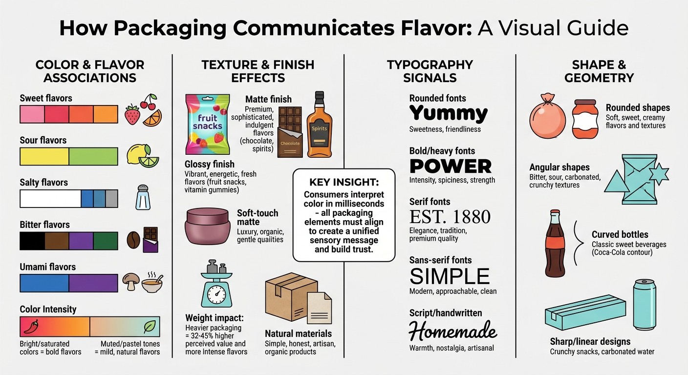
Key takeaways:
Color: Pink and red signal sweetness; yellow and green suggest sourness; darker tones imply bitterness.
Texture: Glossy finishes hint at vibrant, energetic flavors, while matte textures feel premium or natural.
Typography: Rounded fonts suggest sweetness, bold fonts emphasize intensity, and serif fonts convey elegance.
Shape: Rounded packaging aligns with soft, sweet flavors; angular designs suggest sharper or intense tastes.
When all these elements align, they create a unified sensory message, building trust and enhancing the product experience.
How Packaging Elements Communicate Flavor: Color, Texture, Typography & Shape Guide
Packaging Design Trends to Watch in 2026
Clearer flavor and benefit cues for CPG brands competing across shelf, ecommerce, and retail media
More proof-driven claims and ingredient transparency
Sustainable packaging signals without greenwashing
Bolder shelf-blocking and ecommerce readability
Sensory design systems that connect color, typography, photography, brand identity, and product expectations
These same principles apply beyond food and beverage. In skincare marketing trends, packaging has to communicate ingredients, benefits, sustainability, and trust just as quickly.
How Color Shapes Flavor Expectations
Our brains are wired to interpret color in milliseconds, shaping flavor expectations long before we even glance at the text on a package. These color–flavor connections are part of a systematic, crossmodal process, where visual cues influence our perception of taste. This process is fast, intuitive, and surprisingly consistent over time.
For example, a survey of 2,000 consumers found that colors like pink, orange, and red are tied to sweetness, while yellow and green are linked to sourness. Another study with 51 participants revealed that white was consistently associated with saltiness - 15 participants chose white every time across multiple tests. What’s fascinating is how these associations have held steady for more than 30 years.
"Colour clearly conveys to the brain what taste is to be expected."
– Koch and Koch
Common Color–Flavor Pairings
These rapid color cues have led to widely recognized pairings. Red, pink, and orange are often connected to sweet flavors, although red can also hint at spicy or savory tastes. Yellow and green typically suggest sourness, while white is most often tied to saltiness, with blue and gray as secondary options. On the other hand, darker shades like black, brown, and violet (and sometimes green) are linked to bitterness. Blue and violet tones are also commonly associated with umami flavors.
As Charles Spence and colleagues explain, "the basic tastes are not uniquely associated with a particular food source: That is, the colour that they are associated with cannot simply be traced back to the colour of a particular fruit, vegetable, or foodstuff". These connections are more about psychological patterns than direct links to specific foods, guiding our expectations of flavor.
How Color Brightness Affects Flavor Perception
The intensity of a color - its saturation - plays a big role in shaping flavor perceptions. Bright, saturated colors suggest bold and intense flavors, while softer, muted tones evoke milder, more natural profiles. For instance, a vivid orange might bring to mind a tangy citrus punch, while a pale, peachy hue could suggest subtle apricot or creamy vanilla flavors. This effect reinforces the flavor message conveyed by packaging design.
High-contrast color schemes are especially popular for functional foods aimed at athletes, connecting the product’s visual energy with its performance benefits. For consumer packaged goods marketing, these visual cues can help shoppers quickly understand flavor, function, and value before they read the full label.
In contrast, pastel shades or neutral tones often create a sense of understated luxury or emphasize organic, wholesome ingredients.
"Consumers interpret color in milliseconds, making it an essential lever for emotional resonance and product categorization."
– Kaitlin Cushman, Founder, TasteFluent Consulting
Choosing Color Palettes for Specific Flavors
When designing a color palette, think about the emotional response tied to the flavor. For example, blue is ideal for hydrating drinks, green signals plant-based freshness, and pink or purple works well for berry flavors or a touch of elegance. The Coca-Cola Company provides a great example of this strategy, using its iconic red to evoke both its classic flavor and instant brand recognition - even without a visible logo.
Saturation should also match the flavor’s intensity and the product’s context. Muted tones are ideal for subtle, organic ingredients, while bold, vibrant colors suit products with strong, intense flavors. As Kaitlin Cushman points out, "The same coral shade that energizes a kombucha label might feel jarring on a calming adaptogen powder".
To ensure your palette communicates the right flavor message, test it across different mediums - digital, print, and shelf lighting - and use consumer research to understand whether shoppers are interpreting your packaging cues the way you intended. Large-scale consumer data is key here, as individual confidence in matching colors to flavors tends to be low, even though group trends are strong. One last consideration: be cautious with blue packaging for food. While blue drinks have gained popularity, the rarity of blue in natural foods can create subconscious hesitation.
Using Imagery to Communicate Flavor
Imagery plays a key role in reinforcing a product's flavor story. While colors and textures set the stage, visuals take it further by cementing the flavor promise. Packaging images instantly convey taste and texture, helping consumers imagine the experience. For instance, a picture of crisp apples or creamy chocolate connects with a universal sensory language, making the flavor feel tangible and enticing.
Realistic Photos vs. Illustrated Graphics
Photographs have a unique ability to trigger taste memories. They showcase flavors in a way that feels immediate and relatable, offering a clear visual link to quality and authenticity. A close-up of strawberries or a rich swirl of chocolate can remind someone of familiar sensations, like the zing of citrus or the smoothness of a decadent treat.
"Mouthwatering imagery builds anticipation. Custom illustrations add flavor cues and ownability."
– Vanessa Doll, Partner & Director of Relationships at Freshmade
Illustrations, on the other hand, bring a sense of creativity and individuality. Brands like Poppi use bold, abstract fruit graphics to connect with digital-savvy consumers, making their flavors visually exciting and easy to recognize. Similarly, Jeni's Splendid Ice Creams employs playful, handcrafted designs to evoke indulgence and creaminess.
The approach is strategic: use striking, flavor-driven imagery on the outer packaging - what's known as the "First Moment of Truth" - to grab attention on the shelf. Reserve trendier, more flexible designs, like patterns or abstract illustrations, for inner wrappers - the "Second Moment of Truth" - which can be updated more frequently and affordably.
Supporting Visuals That Reinforce Taste
In addition to primary imagery, secondary visuals like patterns, icons, and background graphics can enhance the flavor story. These elements provide quick, additional cues to help categorize and amplify the flavor message. For example, bold oranges and reds can signal energy and vibrant flavors, while greens and earth tones suggest natural or plant-based options.
Pairing visual and tactile elements can make the flavor message even stronger. A glossy finish combined with a bold color scheme, for instance, can emphasize energy and intensity. Kaitlin Cushman of TasteFluent Consulting explains this synergy well:
"A vitamin gummy pouch with a bold, juicy color palette and glossy, peel-and-seal opening - suggesting energy and flavor."
Texture Communication Through Packaging Materials
Packaging textures play a crucial role in shaping flavor expectations. The sense of touch activates brain areas linked to reward and value within just 100 to 200 milliseconds, meaning the material itself often sells the product before anyone even glances at the label.
"The material is doing the selling. The label is just confirming it."
– Rishabh Jain, Managing Director, Confetti
Matte vs. Glossy Surface Finishes
The finish of a package sends powerful flavor signals that align with taste expectations. Glossy surfaces, with their light-reflecting properties, exude energy and vibrancy. This makes them a natural choice for products like fruit-flavored snacks or vitamin gummies, where bold, juicy flavors are key. These finishes grab attention and convey a sense of freshness and approachability.
On the other hand, matte finishes - particularly soft-touch varieties - absorb light and radiate sophistication. They’re often linked to premium products and indulgent flavors like creamy chocolates or fine spirits. A velvety texture amplifies the feeling of exclusivity. Research shows that premium packaging can make products seem 32% to 45% more valuable compared to their economy-packaged counterparts.
This effect ties into the Bouba-Kiki Effect, where consumers subconsciously associate rounded, soft-touch matte surfaces with qualities like gentleness, luxury, and organic appeal. In contrast, sharp-edged, glossy finishes suggest precision and modernity. For brands targeting the upscale market, matte or soft-touch finishes consistently enhance perceptions of quality.
Choosing Materials That Match Product Characteristics
The materials used in packaging go beyond aesthetics - they communicate authenticity and flavor. Weight, for instance, has a surprising impact. Heavier packaging is often equated with higher value and more intense flavors. In one study, chocolate packaged in a container 27% heavier (an additional 50 g, or about 1.8 oz, for a total weight of 234 g, or roughly 8.3 oz) was rated significantly higher in flavor intensity - 5.46 out of 7 compared to 4.74 for the lighter packaging. Every participant noticed the weight difference, which also influenced their willingness to pay more.
Texture also speaks volumes. Uncoated or kraft-paper packaging conveys simplicity and honesty, making it a great fit for artisan or organic products. Meanwhile, rigid boxes with embossed patterns evoke a sense of heritage and craftsmanship, ideal for high-end confectionery or premium supplements.
"The container shapes the value of what it contains, and it does so through sensation, not reason."
– Rishabh Jain, Managing Director, Confetti
Beyond weight and texture, interactive elements can further enhance the sensory appeal of packaging.
Functional Features That Build Anticipation
Interactive packaging features transform the act of unboxing into a sensory experience. Elements like resealable closures, embossed logos, and raised patterns invite touch and suggest meticulous attention to detail. These features not only build anticipation but also reinforce the perception of quality.
Even sound plays a part. The satisfying “thud” of a heavy lid or the crisp “crinkle” of a pouch creates auditory cues that influence flavor expectations. For example, a glossy peel-and-seal opening on a vitamin gummy pouch can evoke energy and juicy flavors. This physical interaction turns unboxing into a memorable moment, with 40% of consumers saying they’d share packaging that feels premium or gift-like on social media.
Typography and Visual Flavor Cues
Typography plays a key role in shaping a product's brand positioning. The choice of fonts can instantly communicate whether an item is fun, refined, or even clinical. For example, rounded typefaces often suggest sweetness, a connection reinforced by consumer experiences in the market. Coca-Cola exemplifies this by combining its iconic red color with a rounded white font, subtly reinforcing the idea of sweetness.
"Typography gives consumers these clues in an instant - and helps you establish tone before the copy does any heavy lifting."
– Kaitlin Cushman, TasteFluent Consulting
This visual language extends beyond fonts, influencing how flavor details are highlighted and presented.
Using Font Weight to Highlight Flavor Details
Font weight, much like color and texture, can guide attention to specific taste attributes. Font hierarchy - through size, spacing, and layout - helps emphasize key flavor claims. For instance, bold or heavy fonts are great for spotlighting elements like spiciness or sweetness levels. Sans-serif fonts like Helvetica convey a modern, approachable vibe, while serif fonts hint at tradition and elegance. Handwritten or script fonts evoke warmth and nostalgia but should be used sparingly to maintain readability. For products like supplements, clear and straightforward typography fosters trust.
Structuring Text for Better Readability
Thoughtful text organization is as crucial as typography itself. Similar to how color and texture create clarity, arranging text strategically ensures consumers can quickly grasp key details. Research shows that people scan packaging in a "backward C" pattern, meaning the most important flavor information should align with this natural flow. Start with the brand name, follow with the product type, and finish with flavor benefits in descending importance. Whitespace is another powerful tool - it keeps designs clean and gives a premium feel to the packaging. Avoid overloading the front panel with jargon to maintain clarity.
"Consumers view information on-pack in a backward C."
– Vanessa Doll, Partner & Director of Relationships, Freshmade
Icons and Ratings for Instant Flavor Communication
Icons take typography a step further by providing quick, visual cues about flavor. Tools like pepper icons and star ratings immediately convey intensity or quality. Abstract fruit illustrations can help consumers imagine bold, recognizable flavors even before tasting. Horizontal curved lines, resembling a "smile", can evoke positive emotions tied to the flavor. Cartoon-style logos suggest playfulness, while patterns like stripes can hint at spiciness, quality, or health benefits. These visual elements subtly shape how consumers perceive the flavor.
Package Shape and Sensory Design
The design of packaging does more than just hold a product - it sets the stage for what customers anticipate inside. Shapes, for instance, carry subconscious associations with taste. Rounded shapes often suggest sweetness, while angular forms like triangles or stars are linked to bitterness, sourness, or even carbonation. This fascinating connection between visual geometry and flavor primes consumers before they even open the package.
These shape associations also extend to texture. Products with hard or crunchy textures, such as honeycomb, tend to align with angular packaging, whereas soft, creamy textures feel more natural with rounded, organic shapes. A great example is the Coca-Cola contour bottle, which instantly communicates the brand's flavor profile without needing text. Interestingly, over half of new product failures stem from a disconnect between the product and its packaging.
Matching Package Format to Product Type
Building on how shape influences taste perception, the format of the packaging also plays a role in shaping expectations. Research shows that angular designs are more commonly found on carbonated water packaging compared to still water. This is no accident. For instance, the iconic red star on San Pellegrino bottles has been signaling the sparkling nature of the beverage for over a century. Similarly, sharper, linear packaging elements are often used for crunchy snacks, while curved, voluminous designs suggest softness or richness. Minimalist glass droppers are perfect for precise products like tinctures, while bold, flexible pouches suit snackable items like gummies.
Combining Multiple Sensory Signals
The best packaging doesn’t just rely on shape; it combines elements like color, texture, and typography to create a complete sensory experience. For example, a glossy finish on a rounded bottle can amplify perceptions of sweetness and freshness, while a matte finish on angular packaging can suggest premium quality and intensity. Texture also plays a key role, acting as a tactile cue that evokes memories and emotions even before the label is read. Kaitlin Cushman from TasteFluent Consulting explains:
"Standing out isn't just about what you sell - it's about how it feels to engage with your brand. And that starts with every texture, color, and curve".
When all elements - shape, color, texture, and typography - are in sync, they tell a cohesive story that builds trust and heightens anticipation.
Eco-Friendly Materials and Natural Flavor Signals
Beyond shape and finish, the materials used in packaging can also set expectations, especially for CPG brands that need to communicate quality, sustainability, and product value in seconds. Sustainable materials, like recycled paper or kraft textures, often communicate simplicity and naturalness, aligning with organic or clean product profiles. For example, a rugged, gritty texture on a protein bar wrapper conveys a sense of earthy authenticity. Materials like corrugated cardboard, molded pulp, wood, or cork can create a rustic feel that reinforces a product’s natural appeal. Pairing these materials with earthy tones and matte finishes can further strengthen a connection to unprocessed, wholesome flavors. However, it’s crucial to ensure the packaging’s visual weight and angularity align with the product’s flavor intensity; mismatches can lead to unmet consumer expectations.
Conclusion
Packaging begins telling its story the moment a consumer picks it up. Every design choice - whether it's the color scheme, texture, or typography - works together to shape flavor expectations and influence buying decisions.
When these design elements harmonize, they create a unified brand message. As Kaitlin Cushman from TasteFluent Consulting puts it:
"True sensory storytelling happens when all elements align - the look, feel, and tone of your packaging reinforce a singular brand narrative".
For example, glossy finishes paired with bright, bold colors suggest energy and intense flavors, while matte textures combined with earthy tones evoke a sense of natural simplicity. Fonts and imagery play a similar role in setting the tone. Sans-serif fonts often feel modern and friendly, while serif fonts suggest tradition and elegance. Imagery - whether it's a crisp photo or a hand-drawn illustration - instantly conveys flavor and personality.
To ensure these visual cues resonate as intended, testing is key. Before launching, validate your packaging's impact in practical scenarios. Conduct In-Home Use Tests (IHUTs) to explore emotional responses to textures and colors. Use digital A/B tests on ecommerce platforms to measure click-through rates, and simulate retail environments with planogram software to see how your design performs under shelf lighting. By carefully testing and aligning every sensory element - color, texture, imagery, typography, structure, and material - brands can build consumer trust and engagement through a cohesive packaging experience. Explore Bigeye’s packaging design services to see how strategy, research, and creative come together to build packaging systems that perform across shelf, ecommerce, and digital channels.
FAQs
How can packaging make something taste sweeter?
Packaging plays a subtle yet powerful role in shaping how we perceive sweetness. For instance, using soft, round shapes and warm or pastel colors on packaging can evoke feelings of sweetness, setting up flavor expectations even before a product is tasted. Similarly, smooth textures or glossy finishes can amplify this impression, subtly hinting at a sweeter experience for consumers. These visual cues work together to influence perception in a way that feels almost instinctive.
What colors best signal sour, bitter, or salty?
Sour flavors tend to be linked with bright, eye-catching colors such as yellow or green. On the other hand, bitter and salty flavors don't usually have strong ties to specific colors. Instead, they often rely on muted or earthy tones to subtly reflect their taste profiles. These visual elements play a key role in helping consumers naturally associate packaging with the flavors they can expect.
Matte vs. glossy - what flavor vibe does each give?
Matte packaging often exudes a subtle, natural feel, which can make products seem more genuine and appetizing. In contrast, glossy packaging delivers a bright, polished look, typically linked to indulgence or high-end flavors. Each type of finish shapes unique sensory expectations for consumers.
Do fonts really change how flavor feels?
Typography has the power to influence how we perceive flavors by tapping into emotional and sensory cues. For instance, bold fonts might bring to mind strong, intense flavors, while delicate script fonts can evoke a sense of sweetness or sophistication. These visual elements work on a subconscious level, subtly shaping how consumers interpret taste.
Rounded vs. sharp shapes - what tastes do they suggest?
Rounded shapes are commonly associated with flavors that are sweet, gentle, and easygoing. On the other hand, sharp or angular shapes are more likely to suggest bitter, sour, or bold tastes. These visual design elements can quietly shape how consumers interpret a product's flavor before even taking a bite.
How do I test if my packaging cues match the flavor?
To ensure your packaging aligns with the flavor it represents, assess how design elements like color, texture, and imagery communicate the intended taste. Use tools like consumer surveys, focus groups, or sensory evaluations to gather feedback on how people perceive the flavor through your packaging. Incorporating principles of crossmodal correspondence - which explores how visual cues affect flavor perception - can guide you in fine-tuning the design. Regular testing and adjustments will help ensure your packaging effectively conveys the intended flavor.

Business Growth
Jun 25, 2026
Seasonal marketing tips for outdoor brands: time SEO, paid media, email & promos to hit U.S. peak buying windows — build a 12‑month plan.


