
How to Design Icon Systems for Brand Consistency
Icons are the visual language of your brand. They simplify communication, guide users, and enhance usability. But without a structured system, they can lead to inconsistency and confusion.
Here’s how to create a unified icon system that works across platforms and strengthens your brand positioning:
Start with a grid and sizing framework: Align icons on a pixel-perfect grid (e.g., 24×24px) to ensure consistency.
Define clear design rules: Stick to one style (outline, filled) and standardize stroke weights, corner radii, and proportions.
Use recognizable metaphors: Universal symbols (e.g., a magnifying glass for search) are easier for users to understand.
Make icons accessible: Use proper ARIA labels, maintain contrast ratios, and ensure compatibility with assistive tools.
Centralize naming and organization: Adopt clear naming conventions (e.g.,
icon-nav-home-filled) and store icons in a shared library.Leverage design tokens: Link icons to reusable variables for color, size, and theme flexibility.
Test with real users: Validate icons for clarity and usability in real-world scenarios.
Building the Foundation: Icon Grid and Sizing
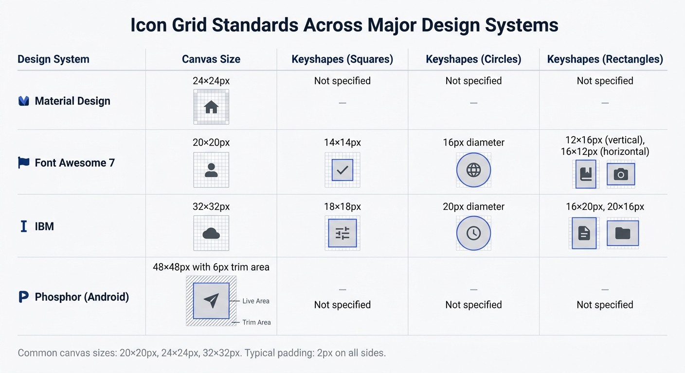
Icon Grid Standards Comparison: Material Design, Font Awesome, IBM, and Phosphor
Creating a consistent icon system begins with a solid grid and sizing framework. Without these, even icons with the same visual style can feel mismatched. A grid ensures every icon is aligned and balanced, maintaining harmony across your brand's ecosystem.
Setting Up a Standard Grid
The icon grid is essentially the "home" for your icons, defining their placement and relationship to digital screen pixels. The canvas size you choose should align with your product's needs. Common industry standards include 20×20px, 24×24px, and 32×32px. For instance:
Material Design uses a 24×24px grid.
Font Awesome 7 opts for 20×20px.
IBM's system works with 32×32px.
Phosphor for Android takes it up a notch with a 48×48px canvas and a 6px trim area.
Within your selected canvas, you'll need to define two zones:
Live area: The part of the canvas where the icon content resides.
Trim area: Padding around the live area to prevent cropping.
A typical setup might involve a 24×24px canvas with 2px padding on all sides, resulting in a 20×20px live area.
"Icons that aren't contained on a canvas, or extend beyond a canvas's edge, run the risk of being cropped or misaligned."
Jory Raphael, Icon Designer at Font Awesome
To avoid blurriness, align all elements to the pixel grid. This means using whole numbers for X and Y coordinates - no decimals like 24.4px. Every edge should snap to whole pixels.
"The final quality is linked directly with how carefully you followed the pixel grid rules. When you're sloppy, the technology knows."
Alexandra Basova, Product Designer
Another tool to ensure balance is keyshapes - basic geometric templates like circles, squares, and rectangles. These help icons of different forms maintain the same visual weight. For example:
On a 20px canvas, Font Awesome 7 uses:
14×14px squares
16px diameter circles
Rectangles of 12×16px (vertical) and 16×12px (horizontal).
On IBM's 32px canvas, these become:
18×18px squares
20px diameter circles
Rectangles of 16×20px or 20×16px.
With your grid in place, you can shift your focus to ensuring uniform sizing and proportions.
Choosing Uniform Sizing and Proportions
Once your grid is set, maintaining consistent sizes and proportions ensures optical balance. For example, a circle with a 20px diameter (area of about 314 square pixels) should visually match an 18×18px square (area of 324 square pixels), even though the math differs.
When working with 1px stroke weights, shift shapes by 0.5px so the stroke aligns perfectly with the pixel grid - this avoids anti-aliasing blur. For 1.5px strokes, ensure the outer border of your icon fits the pixel grid to keep lines sharp.
Reuse common components like arrows or enclosures instead of redrawing them. Hugeicons, which has created over 46,000 icons, emphasizes this approach to maintain proportional consistency while speeding up production.
For asymmetrical icons, manual adjustments may be needed. For instance, shifting a trash bin icon slightly upward by 0.5px can create better visual balance. While users won’t consciously notice perfect alignment, they’ll sense when something feels off.
With these foundations in place, you’re ready to dive into the detailed design guidelines that will refine your icon system even further.
Defining Design Guidelines and Constraints
Once your grid is ready, the next step is to create a set of rules that ensures every icon feels like part of the same family. These documented guidelines are crucial to maintaining a consistent style and preventing deviations. Building on your grid, these rules help establish visual harmony across your entire icon system.
The first and most important step? Pick one style and stick with it - whether it’s outline, filled, or duotone. Each style has its strengths. Outline icons are sleek and modern, making them ideal for dense dashboards or navigation menus. Filled icons, on the other hand, provide higher contrast and are easier to recognize at smaller sizes, which makes them great for selected states or dark mode interfaces. Mixing styles leads to instant inconsistency, which can make your UI feel disjointed. For instance, Adobe's Spectrum design system uses a library of 3,000 descriptive tags to keep icons consistent and searchable across their ecosystem.
Documenting these guidelines isn’t optional - it’s what keeps your icon set cohesive and your design process efficient.
"If I were to call a design the way your interface speaks with your user, then... it would be fair to view a design system as a language."
Tatsiana Tarkan, UX/UI designer
Your documentation should cover every technical detail, from stroke weights to corner radii, so new icons can be created without guesswork.
Stroke Width and Style Decisions
The weight of your strokes plays a huge role in defining the visual identity of your icons. Choose a single weight - commonly 1.5px, 2px, or 2.5px - and apply it consistently across all icons. Thinner strokes give a minimalist, airy vibe that pairs well with light typography, while thicker strokes provide a bold presence that complements heavier typefaces.
Beyond stroke weight, you’ll need to standardize details like stroke caps (round, butt, or projecting) and stroke joins (round, miter, or bevel). Round caps feel softer and more approachable, while butt caps offer a cleaner, more formal look. These small details might seem trivial, but inconsistencies become glaringly obvious in a large icon set. Keep vector stroke files unexpanded so adjustments can be made later if needed.
To ensure visual balance, use the "squint hack" - blur your eyes slightly to check if the icons appear evenly weighted. This trick helps you prioritize optical balance over strict mathematical precision.
Corner Radius and Shape Consistency
The corner radius you choose speaks volumes about your brand’s personality. Sharp corners (0px) convey a serious, technical feel, while rounded corners (2px–4px) create a more inviting, friendly tone. As Adobe’s Design Manager notes, rounded corners can make icons feel more approachable.
Choose one corner radius and stick with it. For a playful consumer brand, a 3px or 4px radius might work well. In contrast, enterprise tools or financial software might benefit from sharp corners to emphasize precision and professionalism. Be sure to document this choice clearly, including how strokes align - inside, outside, or centered. For example, squares often look better with inside or outside alignment, while organic shapes tend to work best with centered strokes.
Additionally, define stroke endings and border alignments to maintain a polished, consistent appearance. Include a "dos and don'ts" guide with visual examples to show proper and improper icon usage. This is especially helpful as your team grows or new designers join the project. The Hugeicons library, which organizes over 46,000 icons into 59 categories, is a great example of how systematic rules can enable scalability while preserving consistency.
Creating Clear and Intuitive Visual Metaphors
Once you've set your design rules, the next step is to ensure your icons communicate their meaning clearly and consistently - without needing extra explanation. The best icons work like visual shortcuts, instantly signaling their purpose. Metaphors connect a visual image to a concept, like a house representing "home" or a magnifying glass symbolizing "search".
Clarity is key. As Uxcel points out, "If a metaphor needs explanation, it is likely not the right choice for an icon". Universal symbols - such as a heart for "like", a paper plane for "send", or a magnifying glass for "search" - are broadly recognized across different cultures and age groups. Designer Helena Zhang puts it well: "When most successful, icons are not only easy to understand for one group of people but are universal across cultures, ages, and backgrounds".
Start by brainstorming keywords related to your concept. This helps identify the most recognizable metaphor. Then, simplify. Icons need to work at small sizes, so remove any unnecessary details that might clutter the design.
Avoid using text inside icons unless it's a globally recognized symbol, like a currency sign - and even then, ensure it matches your style by hand-drawing it. For custom or less familiar icons, pair them with a text label at first. This helps users learn the metaphor without confusion. These steps create a foundation for effective and recognizable design.
Using Established Iconography
Sticking to familiar metaphors - like a trash can for "delete" or a pencil for "edit" - ensures users recognize icons immediately. These symbols have become second nature thanks to years of digital interaction. For example, Phosphor Icons, an open-source library with over 6,000 designs, relies on these conventions to maintain clarity and consistency.
Trying to reinvent the wheel can backfire. Take VSCO, the photography app, as an example. Its abstract icons for navigation (like Feed and Discover) align with its minimalist brand but force users to spend extra time figuring out what each symbol means - adding unnecessary friction. Before creating a new metaphor, ask yourself if an existing one, like a cog for "settings", would work just as well.
It's also essential to avoid cultural missteps. Airbnb, for instance, conducts extensive research to ensure their icons resonate globally and avoid misunderstandings. However, some icons, like the "home" symbol, are universally understood as a starting point.
Testing Custom Designs with Real Users
Even when you build on familiar symbols, testing your icons with real users is critical. Aurora Harley from Nielsen Norman Group emphasizes: "The only way to know whether a particular icon will work is to test it with users".
Start with out-of-context testing early in the process. Show users an icon on its own and ask them what it represents, a method known as free association testing. If most users guess correctly, your metaphor is on track. If not, it's time to rethink the design.
Next, move to in-context testing. Place icons within actual workflows and layouts, and use "first-click tests." For example, give users a task like "How would you delete this item?" and see which icon they click first. If users frequently backtrack after clicking, it’s a sign the metaphor isn't clear enough.
Finally, test your icons in challenging conditions - like low brightness, small sizes (around 16px), dark mode, and non-retina displays. Users typically spend only 50–100 milliseconds scanning an icon, so it must be instantly recognizable even in less-than-ideal settings. Research from Nielsen Norman Group shows that pairing clear icons with short text labels helps users complete tasks about 20% faster. Similarly, a Baymard Institute study found that adding small text labels under icons improved task success rates by 22% on e-commerce sites.
Making Icons Accessible for All Users
Once you have a solid visual design for your icons, the next step is ensuring they are accessible to everyone. Accessibility isn't just a bonus - it’s a necessity for any icon system. Icons should comply with WCAG 2.2 standards: a contrast ratio of at least 3:1 for static icons and 4.5:1 for interactive ones. But contrast is just the starting point. To ensure inclusivity, icons must also work seamlessly with screen readers.
It’s important to differentiate between decorative icons and meaningful icons. Decorative icons are purely aesthetic and don’t convey information or trigger actions. On the other hand, meaningful icons serve a purpose - whether it’s to communicate an idea or enable interaction. Failing to make this distinction can confuse assistive technologies, reducing the clarity and functionality of your icon system.
Adding Text Labels and ARIA Attributes
To make icons accessible, assign the accessible name to the parent element - like <button aria-label="Search"> - instead of the SVG itself. This ensures screen readers can clearly announce the button's purpose.
If your icon is paired with visible text, such as a magnifying glass next to the word "Search", use aria-hidden="true" on the icon. This prevents screen readers from reading the text twice, avoiding redundancy and a choppy user experience.
"An unlabeled icon-only button becomes a mystery control. A decorative icon that is not hidden adds noise and slows down navigation."
CSS3 Shapes
For inline SVGs, add focusable="false" or role="presentation" to keep them out of the keyboard tab order. Avoid using the title attribute for accessibility purposes, as its support among screen readers is inconsistent. Instead, use a .sr-only CSS class to provide hidden text alternatives that assistive technologies can detect.
Icons that change state - like accordion arrows or toggle switches - need special attention. When the state changes, update the ARIA attributes to reflect it. For example, use aria-expanded="true/false" for expandable sections or aria-pressed="true/false" for toggles.
Avoiding Decorative Icons Without Context
Decorative icons without context can clutter the accessibility tree, creating unnecessary stops for users navigating with assistive tools. The fix is straightforward: for purely decorative icons, or those redundant next to visible text, apply aria-hidden="true and, for SVGs, add role="presentation".
Every icon in your system should serve a clear purpose. Using the CSS property currentColor helps maintain consistency by automatically matching the icon’s color to the text color of its parent element. Pair this with semantic HTML - like wrapping interactive icons in <button> or <a> tags - to ensure icons are both visually clear and keyboard accessible.
Organizing Icons with Scalable Naming Conventions
Once your icon designs are cohesive and easy to access, the next step is to ensure they’re used consistently across teams. This is where a clear naming convention becomes essential.
Even the best-designed icon system can fall apart without logical names. When assets are labeled inconsistently, it creates confusion for design, product, and marketing teams. The solution? A solid naming strategy that works for both designers and developers. This approach aligns with your design guidelines and simplifies asset management across the board.
Creating a Logical Naming Pattern
A good naming convention uses straightforward, literal descriptions. For example, naming an icon lightbulb instead of idea makes it easier to understand and ensures the name remains relevant, even if the icon’s contextual meaning evolves.
"If an icon had been named 'lightbulb' from the beginning, teams wouldn't have to learn the name of the icon because they already have a mental model of that symbol." - Symone' Austin, Content Designer, Nordstrom
One effective format is [prefix]-[category]-[name]-[modifier]. For instance, icon-nav-home-filled tells you the asset type (icon), its group (navigation), the object (home), and its style (filled). Using lowercase letters and dashes (kebab-case) ensures clarity and technical consistency.
In January 2024, Nordstrom’s Design Language System team, led by Symone' Austin, revamped their icon library by adopting literal naming and keyword tagging in Figma. This update reduced their icon categories from sixteen to eleven and made it significantly easier for Experience Design and Creative teams to find assets.
To improve searchability, add keyword tags in your design tools. Instead of creating lengthy file names like magnifying-glass-search-find-look, keep the name simple - magnifying-glass - and add "search", "find", and "look" as metadata tags. This keeps file names manageable while enhancing discoverability.
Maintaining Consistency Across Files and Codebases
Consistency in naming creates a bridge between design and development. When Figma components match the names used in React or NPM packages, engineers can quickly identify and implement icons without confusion. This alignment ensures smooth collaboration between teams.
In February 2026, designer Thaís Polonio audited a platform’s design system and found that the "Drag" action was represented by four different icons across various locations. By standardizing to a single icon from the Material Design Icons set and documenting it in a centralized Figma file, the team improved platform-wide consistency and reduced confusion for developers.
Regular audits are crucial as your system grows. Conduct quarterly reviews to catch duplicate icons or naming issues. Establish clear ownership and approval processes for adding new icons to prevent style drift. Without proper oversight, teams might unintentionally create multiple versions of the same icon with different names, which can undermine the system’s integrity.
Integrating Icons with Design Tokens and Theming Systems
Linking icons to a design token system ensures consistency across your designs by aligning color and size through tokens. This approach transforms static icons into flexible, theme-aware elements that adjust automatically when your brand updates its colors, switches themes, or scales across platforms.
Design tokens serve as a single source of truth for visual properties. Instead of embedding fixed hex codes or pixel values into icon files, you use variables that can be updated globally. For instance, if your brand's primary blue changes from #3b82f6 to a new shade, updating a single token applies that change across every icon - no manual edits needed.
Using Design Tokens for Color and Sizing
A robust token system typically follows a three-layer hierarchy: Base, Semantic, and Component. Each layer has a specific role:
Token Layer | Purpose | Example |
|---|---|---|
Base (Primitive) | Defines raw values without context |
|
Semantic (Alias) | Maps raw values to functional names |
|
Component | Applies tokens to specific UI elements |
|
This structure eliminates inconsistencies by ensuring all icons reference semantic tokens like fill: var(--icon-color-muted). It keeps your system cohesive, even as it expands.
For sizing, use a standard grid system, typically based on 8px or 10px increments. Examples include --icon-size-sm: 1rem (16px) for compact layouts, --icon-size-md: 1.5rem (24px) for navigation, and --icon-size-lg: 2rem (32px) for larger elements like hero sections. Aligning icon sizes with layout spacing tokens creates a harmonious visual rhythm throughout your interface.
Modern frameworks simplify token implementation by exposing them as native CSS variables. For example, defining --color-primary-500 in the @theme block can automatically generate utility classes like fill-primary-500 or text-primary-500, streamlining the process.
Implementing Light and Dark Mode Themes
Design tokens also make theme switching effortless. You can assign token values for light mode and override them for dark mode using [data-theme="dark"] or @media (prefers-color-scheme: dark). For instance, --icon-color-primary might reference --color-gray-800 in light mode but switch to --color-gray-200 in dark mode, while the icon component continues to use the same variable name.
"Design tokens provide a consistent and reusable framework for defining colours, spacing, and other design attributes, facilitating easy management and switching between modes without the need to rewrite styles." - Always Twisted
Dark mode tokens can be managed using two approaches: separate files (e.g., colors.tokens and colors.dark.tokens) or a single file with modifiers where each property includes a $value for light mode and a $mods object for dark mode values. Tools like Style Dictionary can automate the conversion of these JSON definitions into CSS variables, wrapping dark mode tokens in the necessary selectors.
For SVG icons, using currentColor for fill or stroke allows them to inherit the text color defined by your semantic tokens. This ensures icons remain legible across themes. Additionally, using the OKLCH color space for token values ensures consistent lightness across hues, which is essential for maintaining contrast when switching between light and dark backgrounds.
Scaling Icon Systems Through Modular Processes
Expanding your icon system while keeping it consistent requires a modular approach. As your library grows from a handful of icons to hundreds, it's crucial to treat it as a dynamic system rather than a static collection of files. Modular workflows help transform icon creation into a repeatable process, ensuring brand consistency and simplifying updates. These workflows also lay the groundwork for efficient design and version control.
Developing Repeatable Design Processes
A structured workflow ensures every new icon aligns with your established standards before being added to the library. Start by defining core parameters like grid size, stroke weight, and corner radius. Then, follow a step-by-step process: choose appropriate visual metaphors, sketch the concept, vectorize it, and test it within a real UI layout before finalizing. This method prevents "style drift", which can occur when designers work without clear guidelines.
"Establishing a sustainable design system for saving, updating, and sharing icons, for yourself and your team, can not only bring you peace of mind, it can also save hours of work." - Isabelle Hamlin, Design Manager, Spectrum, Adobe
To streamline scaling, rely on reusable foundations. Keyshapes - basic geometric templates - help maintain consistent proportions and visual balance. Use Boolean operations to merge shapes, ensuring clean SVG code. Always keep a source version with editable strokes, expanding them only during final export for production.
Using Version Control for Icon Updates
Centralizing your icon library is essential for efficient updates. Tools like a Figma component library or an NPM package can ensure updates automatically propagate across all instances, from buttons to navigation bars.
To maintain order, enforce strict governance by limiting edit access to designated maintainers. These individuals can audit new submissions to ensure they meet your standards. As Bonnie Kate Wolf advises:
"I recommend collecting icons individually, auditing them, and adding them yourself when they are up to standard. Giving your colleagues view access... is enough to get them involved in what you're making without ending up with a cattywampus library".
Use status labels to track the readiness of each icon, and perform quarterly audits to remove redundant assets and confirm alignment with your brand's guidelines. This approach keeps your library clean, organized, and consistent.
Conclusion
A well-organized icon system establishes a cohesive visual language that reinforces your brand across all platforms. From structured grids to naming conventions and design tokens, each component contributes to building a solid foundation for your icons.
In July 2024, Adobe's Spectrum design team, headed by Isabelle Hamlin, completed a three-phase overhaul of their icon system to better support their extensive product portfolio. They developed a core library with over 3,000 searchable tags and implemented a centralized "single source of truth" repository. By using single SVG files paired with CSS color variables, they enabled hundreds of designers to effortlessly synchronize design tokens with production code, streamlining theme workflows.
This example highlights the strategic benefits of a unified icon system. As Hripsime Manukyan explains:
"A well-crafted icon library saves time, reduces inconsistency, strengthens brand recognition, and adapts gracefully as new features, sub-brands, and products come to life".
The takeaway? Treat your icon system as a dynamic framework - one that evolves alongside your brand while staying true to its foundational principles.
FAQs
What icon size should my brand standardize on?
There isn’t a one-size-fits-all approach to icon sizes for branding, but some commonly used dimensions are 16x16px, 18x18px, 20x20px, and 24x24px. These sizes work well for maintaining consistency, alignment, and readability across different platforms. For your brand, sticking to a standard size like 20x20px or 24x24px and using it consistently can help create a unified and easily recognizable icon system.
When should I use outline vs filled icons?
Outline icons are perfect for a clean, minimal look that prioritizes clarity and scalability. These icons work well in designs where simplicity and subtlety are key. On the other hand, filled icons grab attention with their visual weight, making them ideal for highlighting active states or drawing focus to specific elements.
To maintain a cohesive design, stick to one style - either outline or filled - throughout your system. Your choice should align with your brand's personality and the emotional tone you want to project. Whether you aim for sleek and modern or bold and engaging, consistency is key.
How do I keep icons consistent across Figma and code?
Creating a unified icon system in Figma starts with maintaining consistent stroke widths, ensuring all icons share a similar visual style. This uniformity helps your icons look balanced and professional. Use a shared icon library to keep everything organized and easily accessible for your team.
When designing, make sure your icons are resizable by setting proper constraints. This ensures that proportions stay intact, no matter the size adjustments. For exporting, stick to standard formats like SVG, which work well for development. Additionally, align your design tokens - such as sizes and styles - with the development team's specifications. This step ensures smooth integration across platforms and keeps the design consistent everywhere.

Social Media & Content
Jun 13, 2026
Content marketing agency to scale channel-native content and creative testing across Meta, TikTok, retail media, and email — faster testing and higher ROAS.


