
How 2027 Design Trends Will Transform Consumer Brands
Design trends are now tied to sales, not taste alone. With 73% of CPG buying choices made at the point of sale, consumer brands cannot treat packaging, thumbnails, and brand systems like surface work. I’ll show what matters most from the 2027 design shifts, what these patterns mean for growth, and where brands should act first.
TL;DR
2027 design trends favor flexible brand systems that work across shelves, product pages, social feeds, and short-form video.
Warmer color, human texture, and calmer layouts are gaining ground as shoppers push back on cold, over-polished visuals.
Packaging should come first because it shapes fast purchase decisions in stores and supports stronger product-page performance online.
Brands should test design routes before rollout so packaging, PDPs, and media assets match what buyers respond to.
Why 2027 design trends matter for consumer brands
I read this piece as a clear warning: design has moved into the growth stack.
The main point is simple. Brands are showing up in more places, under more time pressure, with less room to explain themselves. A shopper may see a product on a shelf, then later in an Amazon grid, then again in a paid social post. If the brand only works in one setting, it starts to blur.
The article also points to a hard shift in brand systems. 78% of the top 100 global brands now use identity systems that flex across channels, up from 43% in 2020. That tells me fixed logos and one-note palettes are losing ground.
What matters most here is not style for style’s sake. It’s recognition, speed, and memory.
Consumer behavior is pushing design in a warmer direction
The article ties design trends to shopper mood, and that part stands out.
People want brands that feel more human. They also want less polish and less machine-made sameness. Two numbers help frame that shift:
54% of global consumers want a feeling of joy when shopping online
Over 70% of Gen Z say they are tired of overly perfected digital visuals
That shows up in a few ways:
visible texture
heritage cues
calmer layouts
a bit more wit and play
I’d boil it down like this: shoppers want brands that feel less sterile and easier to connect with.
The article also links loneliness and belonging to design choices. That may sound soft, but the effect is concrete. If people want more connection, then color, type, packaging, and image style should signal a shared point of view rather than pure self-image.
The most useful 2027 design shifts in the article
The full article covers a lot, but a few themes do the heavy lifting.
First, emotion-led color systems matter more now. Color has to do a job fast, especially in a 500 x 500 pixel image. If it does not read at thumbnail size, it will struggle online.
Second, packaging with texture and craft cues is gaining traction. Soft-touch finishes, linen effects, grain, and place-based references can help a product feel higher-end and less generic.
Third, calmer digital layouts are growing in value. Not every brand needs to be loud. In crowded feeds and product pages, clean hierarchy and easier visual scanning can cut friction.
Fourth, modular brand systems are no longer optional. A brand needs rules that hold across packaging, email, social, retail media, and PDPs without feeling disconnected.
The bigger idea: brands need visual systems that can stretch without breaking.
Where brands should apply 2027 design trends first
The article is right to put touchpoints in order.
If I were advising a consumer brand based on this piece, I’d start here:
Packaging
Ecommerce and PDPs
Social and short-form video
Email and SMS
That order makes sense because packaging still has the strongest effect on fast purchase decisions. The article cites packaging as shaping up to 80% of shelf decisions. Whether that number varies by category, the priority still holds: packaging is often the first and strongest visual sales tool.
From there, ecommerce is the next pressure point. Online, the pack loses physical presence, so the system has to work through image contrast, readable type, and clear product cues.
Social and lifecycle channels come after that because they help repeat brand signals over time. They matter, but they work best once the core system is set.
What the roadmap gets right
I like that the article does not push every brand toward a full rebrand.
Its roadmap is more grounded:
audit what you have
find weak spots
decide if you need a rebrand, a packaging update, or a modular system
set rules and track results
That is a better sequence than jumping straight into a redesign.
The logo-off test is one of the best ideas in the piece. If people cannot tell it is your brand without the logo doing all the work, the system likely needs help.
The article also pushes measurement, not opinion. That matters. Design teams and brand teams often debate visuals in circles. Tying design to recall, search lift, click-through, and conversion gives teams a better filter.
Where EyeQ fits in
The article positions EyeQ as the step before design production, and that is the right role.
Instead of guessing whether buyers want calm, craft, joy, or heritage cues, EyeQ is presented as a way to test those paths before spending time and budget on rollout. The key value is speed and direction: consumer readouts in 72 hours for standard studies.
That matters most when a brand is about to:
reset packaging
launch a new product
update PDP images
shift paid social look and feel
build a new channel system
I see the case this way: if design now affects conversion and recall, then pre-testing visual routes should sit much earlier in the process.
FAQ
What are the top 2027 design trends for consumer brands?
The main shifts are warmer color systems, more human texture, calmer digital layouts, packaging with craft cues, and brand systems that work across shelf, ecommerce, and social.
Why does packaging still matter so much in 2027?
Packaging shapes fast purchase decisions in stores and also acts as the base image for product listings, retail media, and PDPs. If it fails there, the rest of the funnel gets harder.
How should brands update their visual identity for 2027?
I’d start with an audit, run a logo-off test, check shelf and thumbnail performance, then decide whether the issue is packaging, the broader identity, or channel execution.
Do all brands need a full rebrand to match 2027 design trends?
No. Many brands may get better results from a packaging refresh or a modular channel system instead of a full identity reset.
TL;DR summary
Design now affects growth. It shapes what shoppers notice, click, and remember across stores and screens.
Warmer, more human brand cues are gaining ground. Buyers are pushing back on cold and overly polished visuals.
Packaging is the first place to act. It has the strongest tie to fast decisions and supports ecommerce performance.
Testing should come before rollout. Brands should check visual routes against buyer response before changing packs, PDPs, or media assets.
Ready to test your brand against 2027 design trends?
If your packaging fades on shelf, your product thumbnails are not pulling clicks, or your brand system feels out of step with buyer expectations, the next move is a consumer brand design audit from Bigeye.
Use it to review your packaging, PDPs, and channel assets, spot weak visual signals, and test which design direction fits your category before rollout. If you want to move with less guesswork, request a consumer brand design audit from Bigeye and see which 2027 design trends fit your brand best.
Why Do 2027 Design Trends Matter for Consumer Brand Growth?
Design now drives consumer brand growth in plain view. It shapes what shoppers notice, what they click, and what they remember across packaging, ecommerce product pages, retail media, social posts, and CRM creative. It’s not a last-step polish job anymore. It’s part of how brands get found, earn attention, and turn that attention into sales and recall.
Design as a Growth Input, Not a Cosmetic Choice
The clearest proof shows up at the shelf and in the scroll. Consumers make 73% of their buying choices for consumer packaged goods at the point of sale. That moment no longer lives only in a store aisle. It now includes ecommerce thumbnails, retail media placements, and social content too. In each of those spaces, design helps a brand stand out when the decision window is tiny.
A lot of brands still treat design like a production line item. That’s a mistake. The brands pulling ahead are treating it like a business tool. They’re building modular identity systems that can stretch across packaging, product detail pages, digital ads, and retail settings without losing the thread. Adaptive identity systems help consumer brands stay recognizable across packaging, product pages, retail media, and short-form video. 78% of the top 100 global brands now employ adaptive identity systems, up from 43% in 2020. If a brand still depends on one fixed logo and one static color palette, it’s going to struggle to stay familiar across a messy, fast-moving channel mix.
That shift also lines up with what people want to see right now: brand cues that feel warmer, more tactile, and less machine-made.
The Consumer Shifts Behind 2027 Aesthetics
These growth pressures are changing visual taste in a direct way. 2027 aesthetics reflect where U.S. consumers are emotionally and culturally. You can see the tension in the work itself. Many brands are moving toward craft, warmth, heritage, and more local cues tied to craft or place.
At the same time, joy and play are making a comeback. More brands are using humor and a bit of theater to build a stronger emotional bond. That mix matters. The strongest work doesn’t pick between warmth and wit. It holds both, while still staying recognizable.
EyeQ consumer intelligence shows which emotional territories are gaining traction, so design briefs reflect real consumer signals.
What Consumer Behavior Shifts Will Define Brand Design in 2027?
These 2027 trends come from consumer behavior, not aesthetic forecasting. You can spot these shifts early in color, texture, layout, and packaging.
From Individual Expression to Community-Centered Identity
Loneliness is reshaping what consumers want from brands. 73% of Gen Z in the U.S. report feeling lonely "sometimes or always," and 70% of consumers worldwide say they want to belong to something bigger than themselves. That changes the brief. Brands should move from individual aspiration toward shared belonging. Nivea's "CONNECT" program shows this move clearly, shifting the focus from product benefit to shared connection.
EyeQ consumer intelligence can help a brand see whether a category is already leaning into community-forward messaging or whether that space is still open before making a full identity change.
That shift shows up across every touchpoint. Color palettes, packaging cues, layout choices, and even typography start to signal we instead of just me.
Play, Joy, and Sensory Escapism
54% of global consumers say they want a feeling of joy when shopping online. Joy now drives purchase behavior; it isn't just decoration. That does not mean every brand should crank up the volume. Expressive color and layered layouts work best when they still support clear hierarchy and a clear brand voice. Nostalgia-driven shoppers are also a real and growing segment pushing demand for this kind of work.
The trap is obvious: going loud just to be loud. The brands doing this well use playful design with discipline. Bright colors, offbeat layouts, and sensory details need to feel tied to the brand, not pasted on like party streamers.
Craft, Heritage, and Calm in an AI-Saturated Market
Over 70% of Gen Z consumers report fatigue with overly perfected digital aesthetics, preferring visuals that feel imperfect and human. That matters more as AI-generated imagery becomes common and, frankly, a little too polished. Handmade textures, visible grain, brush strokes, and restrained layouts are starting to act as trust signals. At the same time, a pull toward calmer, slower visuals is pushing consumers toward brands that lower cognitive load through heritage-rooted typography and tactile packaging cues. Snapple's move back to a heavily serifed font pulled directly from its own archives is one example.
60% of consumers say emotional and sensory experiences play a decisive role in brand preference. For brands, the question is simple: does the category reward warmth, craft, and calm, or does it still lean on cold minimalism?
Those signals then show up in practical design choices, including:
Color
Texture
Hierarchy
Packaging
Next, those signals become specific design systems.
What Are the 7 Design Trends Reshaping Consumer Brands in 2027?
The seven design trends reshaping consumer brands in 2027 tie straight to results like shelf visibility, premium perception, and conversion. These shifts aren’t happening in a vacuum. They reflect where consumer behavior is already headed: community over individualism, joy as a buying trigger, and craft as a signal of trust.
Emotion-Driven Color Systems and Expressive Visual Codes
As shoppers lean toward warmth, belonging, and faster visual recognition, color stops being mere decoration and starts doing a job. In 2027, color has to work harder. It needs to signal warmth, energy, and trust at a glance. Warm earth tones can help cue trust, while brighter accents should show up only where energy and shareability matter most. The larger move is clear: brands are shifting toward warmer, trust-led palettes and away from cold, generic systems that disappear in the feed. The test is blunt but useful: if a design doesn’t stand out at thumbnail size, it will likely struggle in e-commerce.
Tactile Packaging, Heritage Craft, and Visible Sustainability
When shoppers make a choice in seconds, packaging has to signal premium value right away. Since packaging still shapes that decision moment, tactile finishes matter. Soft-touch coatings, linen textures, and structured surfaces create contrast against flat, digitally printed packaging and help premium brands stand apart. Heritage-rooted visual craft, such as regional references, artisanal typography, and folk art, gives brands something private labels can’t easily copy. A competitor may match price, but it can’t copy a brand story with depth and place behind it.
Sustainability is shifting too. The focus is moving away from vague recycled-material claims and toward materials like mycelium, seaweed, and cork that make the story visible and physical. That shift can also help at retail in a very practical way: better eco-filter matching in e-commerce search results. The Luma & Leaf case study shows how distinctive patterns and upcyclable packaging can support launch performance.
Phygital Systems, Modular Design, and Minimalist Calm
The same visual logic now needs to hold up across both physical and digital touchpoints. For most consumer brands, the near-term priority is building a modular system that stays consistent across packaging, PDPs, social, and email. In plain terms, shoppers should recognize the brand whether they see it on a box, a product page, a paid social ad, or in their inbox.
Calmer layouts also matter more now, especially on PDPs and in CRM creative. Natural textures, refined serif fonts, and restrained hierarchy can keep a brand feeling premium without adding visual clutter.
The next move is simple: test which of these visual directions your category will reward before rolling out a full system. What plays well in beauty may fall flat in snack, and what works on shelf may not win on mobile. That’s why validation comes before scale.
How Should EyeQ Consumer Intelligence Guide Design Decisions Before Creative Production Begins?
Design calls get expensive fast when they’re built on gut instinct. EyeQ consumer intelligence helps brands test what people respond to before creative production starts, so teams can shape packaging and design around audience signals instead of chasing looks that may not land.
EyeQ cuts guesswork by showing how a specific audience reacts across emotion, packaging, and channel before concepting begins.
EyeQ turns audience signals into sharper design briefs tied to behavior, not just style.
EyeQ gives brands actionable readouts in 72 hours, which helps teams test design paths before a full rollout.
EyeQ also links design choices to commerce and media KPIs, including PDP engagement, click-through, and conversion by channel.
Turn Consumer Signals into Better Design Briefs
Once a trend is spotted, the next move is simple: check whether it fits the people you want to reach. EyeQ uses AI-powered quantitative and qualitative research to show whether a brand’s audience is responding to signals like Strategic Joy, Desire for Escape, or Cautious Optimism - and those findings shape the brief before creative development begins. That changes the brief from a mood-board exercise into a behavior-led plan.
Instead of saying, “Make it feel modern,” teams can move with more precision. The brief can point to palette, texture, typography, and hierarchy based on what the target consumer already trusts. That matters, because design isn’t just decoration. It’s often the first sales message a shopper sees.
Test Design Directions Before a Full Rollout
Packaging mistakes cost money, and the shopper decision window is short. EyeQ delivers actionable insights in 72 hours, which gives brands time to test concepts and packaging before rollout.
The smart move is to judge each direction through the same lens in both physical retail and digital commerce. A pack that works on shelf also needs to read well in an Amazon grid, a PDP image, or a social feed.
Design Direction | Physical Retail Impact | Ecommerce / Amazon Impact |
|---|---|---|
Human & Expressive | High shelf standout vs. private label | Distinctive thumbnail; strong social share |
Tactile Craft | Premium perception via texture cues | Distinctive vs. flat digital competitors |
Elemental Folk | Signals provenance and trust | Strong in search for "authentic" or "artisan" |
Candid Camera Roll | Gen Z engagement; anti-corporate feel | Authentic thumbnail; social content fuel |
Because shoppers often meet brands first in Amazon grids and social feeds, a design that reads cleanly at 500x500 pixels has an edge in ecommerce. If it falls apart at thumbnail size, that’s a warning sign before launch, not after.
Use the same lens to judge whether a direction wins in-store and on-screen.
Connect Design Choices to Commerce and Media KPIs
Once a direction is chosen, the next step is measuring whether it helps sales and media performance. Validated design can improve market performance because it makes the product easier to read and easier to choose.
Bold color systems and clear visual cues cut the time consumers spend decoding a product, which lowers decision friction and directly increases conversion rates. That’s the plain business case for testing design early. When shoppers don’t have to work to understand what they’re looking at, they move faster.
There’s another layer here too. Aligning the emotional territory in the brief with pricing and channel strategy helps prevent mixed signals at shelf. If the package says one thing and the price point or placement says another, trust slips. Brands can use those same design signals to improve PDP engagement, click-through, and conversion by channel.
Where Should Consumer Brands Apply 2027 Design Trends First to See the Fastest Impact?
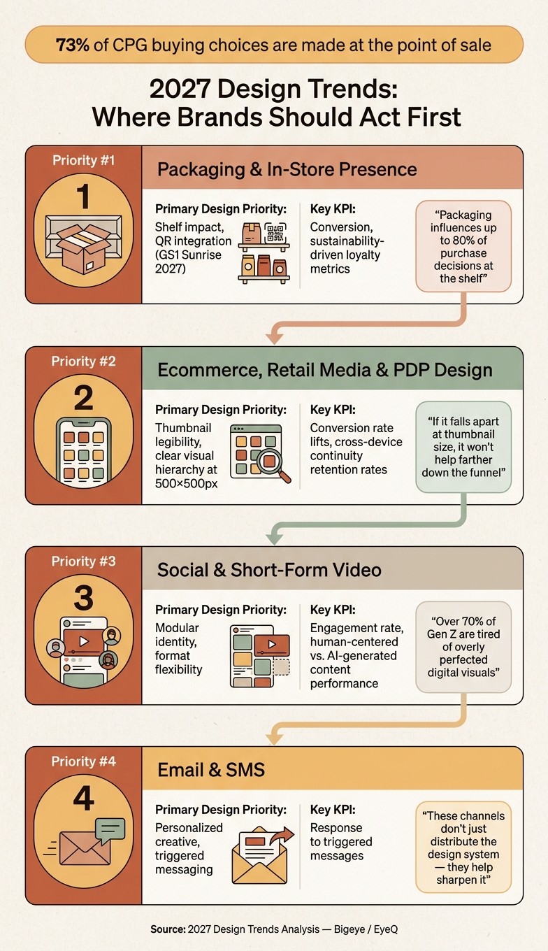
2027 Design Trends: Where Brands Should Act First
If a brand wants fast movement from 2027 design trends, it should start where buying decisions happen in seconds: packaging first, ecommerce next, then social and lifecycle channels. After a direction is proven, the smart move is to put it where it can shift behavior fastest. That means starting with the touchpoints tied most closely to conversion, recall, and trust.
Packaging and In-Store Presence
Packaging is the highest-leverage touchpoint because it has to earn trust fast. At the shelf, shoppers don’t stop for long. They scan, compare, and move on. That’s why packaging should be the first place to apply a new visual system.
It also carries serious weight in the buying moment. Packaging influences up to 80% of purchase decisions at the shelf, which makes it the clearest starting point for brands that want to see impact fast.
In-store, the design has to work at a glance. Color, typography, layout, and key brand cues need to land almost instantly. The same visual system should run across the pack and any supporting display materials so the brand reads the same way across the aisle. If the package says one thing and the display says another, shoppers feel that disconnect, even if they can’t name it.
GS1 Sunrise 2027 will make 2D barcodes standard at checkout, so packaging should be QR-ready now. That change isn’t just about compliance. It also gives brands a clean way to connect shelf presence with digital content, product details, promotions, and post-purchase journeys.
If the system works on shelf, the next test is simple: does it still stand out in a digital grid?
Ecommerce, Retail Media, and PDP Design
Ecommerce strips away some of the things packaging relies on in stores. There’s no physical texture, no shelf block, no in-person scale. On a product listing page or retail media placement, the thumbnail has to do the heavy lifting.
What matters most here is color contrast, a clear visual hierarchy, and type that still reads on a small screen. If the design falls apart at thumbnail size, it won’t help much farther down the funnel. Shoppers make snap judgments online too, and they do it while scrolling fast.
PDP design should stay aligned with the thumbnail so the story remains consistent from search result to page. That continuity matters. If the product image promises one feel and the PDP delivers another, trust drops. A clean handoff from thumbnail to PDP helps the brand feel familiar, intentional, and easy to buy from.
Social, Short-Form Video, Email, and SMS
Social, short-form video, email, and SMS need modular identities that can flex across formats without losing recognition. These channels move fast, and shoppers don’t sit with each message for long. They scan across repeated exposures, often over days or weeks, and recognition depends on seeing the same color, type, and visual cues again and again.
That’s the key shift. Social execution shouldn’t just be about making each asset fit a format. It should help the brand stay recognizable while people move quickly through feeds, stories, inboxes, and text threads. A good system makes that repetition work in the brand’s favor.
Email and SMS are also useful places to test personalized creative. When the visual system has enough flexibility, brands can measure how triggered messaging performs and use those signals to tune the broader identity system. In other words, these channels don’t just distribute the design system. They help sharpen it.
Touchpoint | Primary Design Priority | Key KPI |
|---|---|---|
Primary Packaging / In-Store | Shelf impact, QR integration | Conversion, sustainability-driven loyalty metrics |
Ecommerce / Retail Media | Thumbnail legibility, personalized visual system | Conversion rate lifts, retention rates from cross-device continuity |
Social / Short-Form Video | Modular identity, format flexibility | Engagement rate, human-centered vs. AI-generated content performance |
Email / SMS | Personalized creative, triggered messaging | Response to triggered messages |
Use EyeQ to validate the highest-risk touchpoints before a packaging reset or media launch.
These touchpoint priorities set the rollout order for the next 12 to 24 months.
What's the Right 12–24 Month Roadmap for Building a 2027-Ready Design System?
A 2027-ready design system doesn’t come from a giant overhaul all at once. It comes from sequencing the right work in the right order over 12 to 24 months. Start by auditing what you already have. Then prioritize the changes most likely to move the needle. After that, put governance and measurement in place so the system stays consistent as it grows. Done well, this roadmap turns consumer signals into a brand system that feels warmer, more distinct, and much easier to scale.
Audit Identity, Packaging, and Digital Assets Before Investing
Start with an audit across packaging, ecommerce, and social. Look for inconsistency in color, typography, texture, and brand recognition. The key question is simple: can the current system support emotion-led color, tactile cues, and calmer digital layouts without falling apart across channels?
Run a logo-off test. If people can’t still spot the brand without the logo doing all the work, the visual system isn’t strong enough yet. That makes the audit more than a clean-up exercise. It becomes a filter for deciding what the brand can actually own in market.
Once the audit shows where the system is weak, use that gap to find the smallest change likely to deliver the biggest commercial lift.
Choose Between a Rebrand, Packaging Refresh, or Modular Creative System
Not every brand needs a full rebrand. In many cases, a packaging refresh or a modular creative system is the smarter first move, especially when those are the touchpoints shoppers see most across packaging, ecommerce, retail media, and social.
Match the level of investment to the weakest part of the current system. In most cases, it makes sense to begin with the smallest move that improves the highest-value touchpoint. That often means fixing packaging first, then ecommerce and retail media, then social and lifecycle assets.
Once the core system is set, lock it down with clear rules so assets stay aligned from channel to channel.
Use Governance and Measurement to Keep the System Consistent Through 2027
Governance is what keeps a good system from drifting. Encode brand rules in design tokens so updates stay aligned across channels and review cycles move faster. Brands using this method can cut compliance review time by up to 60%.
Measurement matters just as much. Track brand-search lift, unaided recall, category share-of-search, and branded versus unbranded organic traffic ratios to connect design choices back to business results. Brands that use quantitative testing, including eye-tracking and recall studies, during identity design see 30% higher brand distinctiveness scores than brands relying only on qualitative judgment.
That data helps teams decide what should stay fixed and what can flex by channel. Use EyeQ to connect design decisions to commerce and media KPIs as the system changes over time.
Phase | Timeframe | Primary Action | Key Output |
|---|---|---|---|
Audit | Months 1–3 | Logo-off test and inconsistency assessment | Distinctive visual system |
Prioritize | Months 3–6 | Packaging refresh or adaptive identity investment | Modular brand toolkit |
Govern & Measure | Months 6–24 | Design tokens, recall testing, brand-search lift tracking | Adaptive, measurable system |
What Are the Most Important 2027 Design Takeaways Consumer Brands Should Act On Now?
Put these shifts together, and five clear priorities stand out for consumer brands. Design in 2027 is a growth input, not a finishing touch. The brands pulling ahead will treat visual identity as a business tool tied to emotion, sensory experience, and sales results, not as surface-level styling.
Emotion and honesty are replacing polish. Shoppers are responding to brand systems that feel warmer, more textured, and more human.
Brands also need stronger memory triggers that go past what people see. Sensory cues beyond visuals - texture, material, and sound - will build recall and help brands stand apart.
Calmer digital systems and modular identity rules will cut mental strain and make it easier to scale across channels.
And one last test matters most: check design directions against consumer signals before launch. Validate major design decisions with consumer signals before rollout.
Is Your Brand Ready for What Consumers Expect in 2027?
If those 2027 signals match your category, the next move is a design audit. A consumer brand design audit from Bigeye shows where your brand fits, where it fades into the background, and which visual changes are most likely to drive growth. Instead of leaning on opinion or internal taste, the audit looks at consumer signals to find open visual territory in your category and point to the design moves that matter most.
Once you know what the signals are saying, you can use them to test packaging, PDPs, and social creative before anything goes live. EyeQ delivers actionable consumer insights in as fast as 72 hours for standard studies, so teams can validate design directions before a full rollout.
If your current brand system isn’t built for 2027, this is the time to look hard at it. If your packaging disappears on the shelf, your PDP thumbnails aren’t driving clicks, or your visual system no longer lines up with what shoppers expect, don’t wait for the market to corner you into a rushed redesign. Request a consumer brand design audit to find the design moves that matter most over the next 12–24 months.

Business Growth
Jun 16, 2026
Start with the parent and proof—name, compliance, packaging, and staged measurement decide a baby brand's success in 2026.


