
Best CTA Button Colors for Social Ads
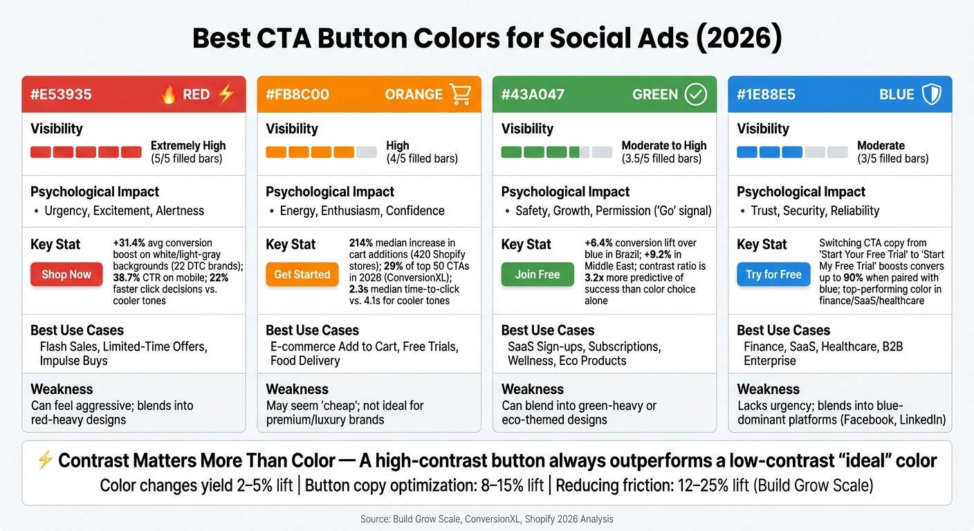
CTA button colors directly impact ad performance by influencing visibility, psychology, and user behavior. In 2026, the four most effective colors for social ads - red, orange, green, and blue - each serve unique purposes. The key takeaway? Contrast matters more than the color itself. A button that visually stands out against its background will outperform even the most "ideal" color. Here's a quick breakdown:
Red: High visibility and urgency; ideal for flash sales and impulse actions.
Orange: Balances energy and friendliness; great for e-commerce and free trials.
Green: Signals safety and progress; best for wellness, eco-products, and subscriptions.
Blue: Conveys trust and reliability; perfect for finance, SaaS, and healthcare.
Quick Comparison:
Color | Visibility | Psychological Impact | Best Use Cases |
|---|---|---|---|
Red | Extremely high | Urgency, excitement | Flash sales, limited-time offers |
Orange | High | Energy, enthusiasm | E-commerce, free trials |
Green | Moderate | Safety, growth | Subscriptions, wellness products |
Blue | Moderate | Trust, reliability | Finance, SaaS, healthcare |
While color choice influences conversions, contrast, button copy, and placement often drive bigger results. Test your designs to find what works best for your audience.
Best CTA Button Colors for Social Ads: 2026 Comparison Guide
1. Red CTA Buttons
Visibility and Contrast
Red buttons grab attention because of their sharp contrast, a phenomenon explained by the Von Restorff effect. This principle shows that elements with strong contrast naturally stand out. When buttons achieve a contrast ratio between 6:1 and 8:1, they can deliver a 17% increase in performance compared to the baseline ratio of 4.5:1.
However, red CTAs lose their effectiveness on red-heavy backgrounds. To ensure your button stands out, run a quick grayscale test on your ad creative. This will reveal if your CTA has enough visual separation to catch the eye.
Contrast Ratio | Average Conversion Rate | Lift vs. Baseline |
|---|---|---|
Under 3:1 | 1.8% | -22% |
3:1 to 4.5:1 | 2.1% | -9% |
4.5:1 to 6:1 | 2.3% | Baseline |
6:1 to 8:1 | 2.7% | +17% |
Over 8:1 | 2.6% | +13% |
(Source: Build Grow Scale analysis of 234 product pages [5])
This contrast advantage is a crucial foundation for red buttons, but their impact goes beyond just visibility.
Psychological Associations
Red has a unique ability to trigger physiological responses - it slightly raises heart rates and creates a sense of urgency. This makes it especially effective on fast-moving platforms like TikTok and Instagram, where users scroll quickly and decisions are made in seconds.
In the U.S., red conveys urgency and energy, making it ideal for flash sales or time-sensitive promotions. However, its meaning shifts across cultures. For example, in China, red symbolizes luck and prosperity. If you're running campaigns for international audiences, these cultural nuances are worth considering.
These psychological triggers often translate to measurable improvements in performance.
Performance Evidence
Red CTAs combine visual appeal with psychological effects to deliver impressive results. A 2026 analysis of social ads highlighted their effectiveness:
A study of 22 DTC brands revealed that red CTAs on white or light-gray backgrounds boosted conversions by an average of 31.4%.
Across 3,800 live stores, red buttons outperformed green ones by 14.2% on average, with the gap widening to 28% during flash sales with countdown timers.
On mobile, red and orange CTAs achieved a 38.7% click-through rate, which was 2.1x higher than blue or gray alternatives. A neuromarketing study also found that red buttons prompted 22% faster click decisions than cooler-toned buttons.
"A high-contrast blue button will outperform a low-contrast red button every time, regardless of the emotional associations each color carries." - Atticus Li, Experimentation and Growth Leader
Best Use Cases
Red CTAs are perfect for driving quick, decisive actions like "Buy Now" or "Shop the Sale." They're particularly effective for ecommerce flash sales, event registrations, and product launches where hesitation can hurt conversions.
That said, avoid red buttons if your brand's color scheme is already red-heavy. Without contrast, the button will blend into the background and lose its effectiveness. Instead, pair red CTAs with neutral or white backdrops, and consider adding reassuring copy nearby - like "Free returns" or "No commitment required" - to balance the urgency without undermining it.
2. Orange CTA Buttons
Visibility and Contrast
Orange is a color that naturally draws attention. It’s warm and noticeable without the intensity of red, which can sometimes signal "stop." This makes orange a versatile choice for call-to-action (CTA) buttons. It works well on both white and dark backgrounds, but it’s especially striking when paired with cool-toned colors like blue or teal. The contrast between complementary colors creates a visual tension that helps the button stand out. To ensure your orange button maintains strong visibility, try a grayscale test - if it’s still clear without color, you’re on the right track.
Psychological Associations
Orange isn’t just about looking good - it also taps into psychology. The color strikes a balance between urgency and friendliness, making it ideal for social ads or casual, user-generated content.
"Orange combines the urgency of red with the friendliness of yellow. It conveys enthusiasm and excitement." - Nora Kramer, Designer + Brand Strategist, Nora Kramer Designs
Unlike red, which can feel demanding, orange exudes energy and approachability. This makes it perfect for actions like "Get Started" or "Free Trial", where you want to encourage clicks without overwhelming users. However, it’s worth noting that orange doesn’t always align with luxury branding. Its playful and approachable vibe might clash with a high-end, premium image.
Performance Evidence
The numbers back up orange’s effectiveness. A 2026 Shopify study involving 420 stores revealed that switching an "Add to Cart" button from gray to high-contrast orange led to a median 214% increase in cart additions, with 12% of stores seeing over a 300% boost. Similarly, ConversionXL’s 2026 analysis of 310 top-performing CTAs found that orange accounted for 29% of the top 50 buttons, a 9% jump from 2023.
On mobile, orange buttons in the first viewport achieved a 38.7% click-through rate, more than double the performance of blue or gray buttons on the same pages. Orange CTAs also prompt quicker actions - the median time-to-click for warm-toned buttons is 2.3 seconds, compared to 4.1 seconds for cooler tones.
Best Use Cases
Orange CTAs excel in specific scenarios. They’re a natural choice for ecommerce marketing "Add to Cart" buttons, SaaS free-trial prompts, and food delivery "Order Now" actions. Amazon’s long-standing use of orange for its purchase buttons highlights how effective the color is at signaling action across a platform.
If your brand’s primary color is blue, orange is an especially smart choice for CTAs. Complementary color pairings have demonstrated an average 38.2% boost in sales during testing. Just ensure that the button text - whether white or black - meets WCAG 2.1 contrast standards to ensure readability for all users.
3. Green CTA Buttons
Visibility and Contrast
Green buttons bring a unique edge to design, offering a subtle yet effective way to grab attention. Their success often lies in how well they contrast with the surrounding elements, a concept rooted in the Von Restorff effect. For instance, on white or light-gray backgrounds, green naturally pops, making it an excellent choice for call-to-action (CTA) buttons. However, if your ad's design already leans heavily on green tones, the button risks blending in and losing its impact.
"Any button color that contrasts strongly with the surrounding page elements will outperform a button that blends in, regardless of the specific color used." - Atticus Li, Experimentation and Growth Leader
For best results, pair green buttons with white text to ensure high readability. A simple grayscale test can help confirm if the contrast is strong enough to make the button stand out (as seen in 78 out of 90 high-converting examples).
Psychological Associations
Green carries an intuitive message: go. This association is deeply ingrained, thanks to traffic lights.
"Green means go. Traffic lights have been training every human brain for over a century. The association between green and forward movement, permission, and progress is hardwired at this point." - Krunal Vaghasiya, Marketing Tech Expert, WiserNotify
This makes green an ideal choice for low-commitment actions - those clicks that feel safe and encourage progress. Beyond the "go" signal, green is often linked to themes like health, nature, and growth. It's no surprise that brands such as Whole Foods and HelloFresh use green to strengthen their identity and align with these positive themes.
Performance Evidence
The effectiveness of green CTAs depends heavily on context and audience. In a meta-analysis of 89 stores, green buttons outperformed red in 35% of tests, while red won in 38%, and 27% showed no significant difference. A notable example comes from a 2011 HubSpot test, where red buttons performed 21% better than green, largely because the page design was already dominated by green tones. This underscores an important principle: contrast ratio is 3.2x more predictive of success than the specific color choice.
Regionally, green buttons have shown impressive results. For example, in Brazil, green CTAs deliver a 6.4% conversion lift over blue, while in the Middle East, the lift is even higher at 9.2%. For U.S. campaigns targeting global audiences, these insights can be a game-changer when crafting a strategy.
Best Use Cases
Green CTAs work particularly well for brands and industries tied to wellness, eco-friendliness, and growth. They’re a natural fit for SaaS sign-ups, subscription services, and health-focused products. HelloFresh, for instance, uses bright green buttons to emphasize freshness, while Spotify incorporates green to signal growth and momentum across its platform.
When it comes to button copy, action-oriented verbs like "Get Started", "Join", or "Claim" tend to resonate more with users than heavier terms like "Submit". That said, if your design already features a lot of green, consider using a contrasting color for the button to ensure it stands out. Up next, we’ll explore how blue CTA buttons can add even more variety to your ad strategies.
4. Blue CTA Buttons
Blue stands out as a favorite when it comes to conveying trust and reliability, making it a strong contender for call-to-action (CTA) buttons, especially after green's energetic appeal.
Visibility and Contrast
Blue enjoys universal popularity across different demographics and genders. However, on platforms dominated by blue - like Facebook and LinkedIn - a blue CTA button can easily fade into the background. This lack of contrast can cause the button to lose its impact.
Contrast is the game-changer here. A blue button pops on a white or light-gray background, but if your page already has a lot of blue, consider a contrasting color like orange for the CTA.
"If your logo and nav are blue, a blue CTA blends in and gets ignored. Pick a color that contrasts with your palette." - WiserNotify
Psychological Associations
Blue is often linked to trust, calmness, and authority. Unlike colors like red or orange, which create urgency, blue provides a sense of safety and reduces perceived risk. This makes it ideal for industries where credibility is critical - finance, healthcare, B2B SaaS, and insurance.
That said, this calming effect can work against you in certain contexts. Blue is perfect for actions like "Try for Free" or "Schedule a Consultation", but it's less effective for driving urgency or impulse decisions.
"What works for a travel site (urgency, orange, 'Book Now') will fail for a wealth management firm (trust, blue, 'Schedule Consultation')." - Bhavesh Verma, IT Consultant & Research Analyst
Performance Evidence
Blue consistently ranks among the top-performing CTA button colors. Many leading brands use blue CTAs to build trust right at the point of conversion. Interestingly, the button's text can sometimes have a bigger impact than its color. For example, switching from "Start Your Free Trial" to "Start My Free Trial" has been shown to boost conversions by up to 90%. Pairing this kind of copy adjustment with a well-contrasted blue button can amplify results even further. These insights show that blue CTAs, when used thoughtfully, are highly effective in trust-sensitive situations.
Best Use Cases
Blue CTA buttons shine in scenarios where trust and consideration are key. Here are some industries where blue works best, along with typical CTA examples:
Industry | Typical Blue CTA Text |
|---|---|
SaaS / Tech | "Try it for Free", "Get Started" |
Finance / Banking | "Get a Quote", "Open Account" |
Healthcare | "Book Now", "Learn More" |
B2B / Enterprise | "Contact Sales", "Request Demo" |
Insurance | "Check Rates", "Get My Quote" |
To maximize the effectiveness of your blue CTA, surround it with trust signals like "No credit card required" or security badges. These elements reinforce the sense of safety and credibility that blue naturally conveys, helping to lift conversion rates. When combined with strong contrast and strategic messaging, blue CTAs can be a powerful tool for driving action in trust-focused contexts.
Pros and Cons
Let's break down the pros and cons of different CTA button colors. Each color has its own strengths and challenges, depending on the context and audience. Here's a quick overview to help you decide:
Color | Visibility | Psychological Impact | Key Strengths | Key Weaknesses | Best Use Cases |
|---|---|---|---|---|---|
Red | Extremely high | Urgency, alertness, excitement | Hard to miss; creates an immediate response | Can feel aggressive; blends into red-heavy designs | Flash sales, limited-time offers, impulse buys |
Orange | High | Confidence, energy, enthusiasm | Works well on light or dark backgrounds | May come across as "cheap"; not ideal for premium brands | E-commerce, lead generation, free trials |
Green | Moderate to high | Safety, growth, permission | Signals "go" and low friction; feels natural and calming | Can blend into wellness or eco-friendly site designs | Subscriptions, wellness, finance, eco-products |
Blue | Moderate | Trust, security, reliability | Universally appealing; professional and stable | Lacks urgency; often used in navigation bars | SaaS, banking, healthcare, enterprise software |
When choosing a CTA color, contrast matters more than the color itself. For instance, a red button performed 21% better than a green one on a predominantly green page - not because red is inherently better, but because it stood out more.
"The color alone isn't the variable. The relationship between the color, the background, the brand, and the action is what determines whether it converts." - Krunal Vaghasiya, Marketing Tech Expert, WiserNotify
Interestingly, while color can influence conversions, it's not the most impactful factor. Research from Build Grow Scale highlights that color changes typically yield a 2–5% lift in conversion rates. In comparison, optimizing button copy can boost conversions by 8–15%, and reducing friction can lead to a 12–25% increase. So, if you haven't experimented with your CTA copy yet, start there. Replacing generic verbs like "Submit" with more benefit-driven ones like "Get" or "Unlock" often delivers better results.
Another tip? Run a greyscale test to ensure your CTA stands out. If it blends into the background in greyscale, it likely lacks the contrast needed to grab attention.
Conclusion
After diving into the 2026 data, one thing is clear: there’s no one-size-fits-all CTA color. Red ignites urgency for flash sales, orange delivers consistent results in e-commerce, green fosters trust for seamless actions, and blue conveys credibility for high-value items.
What truly matters is contrast. A button that stands out sharply against its background will outperform a "psychologically ideal" color that fades into the design. But color alone isn’t enough - effective copy, strategic placement, and audience targeting are just as critical. Remember, what resonates with one audience might fall flat with another. For example, bold, vibrant colors tend to attract younger users, while more subdued tones appeal to premium buyers. Testing is non-negotiable - A/B testing is your best friend here.
This is where data-driven tools like Bigeye's EyeQ and EyeSight come in. These platforms provide real-time performance metrics and unified tracking across channels, helping you make informed decisions based on actual results, not assumptions. With Bigeye’s blend of consumer insights, creative strategy, and performance media, your CTA designs are always backed by hard data. Whether you’re optimizing for Meta, TikTok, Google, or other platforms, this integrated approach ensures your campaigns stay sharp and effective.
Start with compelling copy, prioritize contrast, and let the numbers guide your color choices.
FAQs
How do I choose a CTA color for my ad background?
When selecting a CTA button color for your ad background, prioritize contrast, brand alignment, and cultural relevance. A high-contrast button ensures visibility - aim for a contrast ratio of at least 4.5:1. Stick to colors that reflect your brand identity to strengthen recognition and trust. Lastly, take into account how colors are perceived in different regions to maximize engagement and conversions.
What contrast ratio should my CTA button meet?
Your CTA button needs a contrast ratio of at least 4.5:1 for regular text and 3:1 for larger text. This helps ensure the button is both easy to read and accessible, meeting widely accepted standards.
How do I A/B test CTA button colors effectively?
To run an effective A/B test for CTA button colors in 2026, prioritize contrast, clarity, and context. Experiment with a range of color options that sharply contrast with your background to grab attention. Test these variations across different audience groups and monitor key metrics like click-through rates (CTR). Use the insights from actual user interactions to fine-tune your selection, as the ideal button color will vary depending on your brand and target audience.

Paid Media & Performance
Jul 22, 2026
Paid Social Audit guide to fix ROAS under 1.0: prioritize tracking, media, creative, and post-click fixes to stop wasted ad spend.


