
Design and Creative Testing of Wine Labels
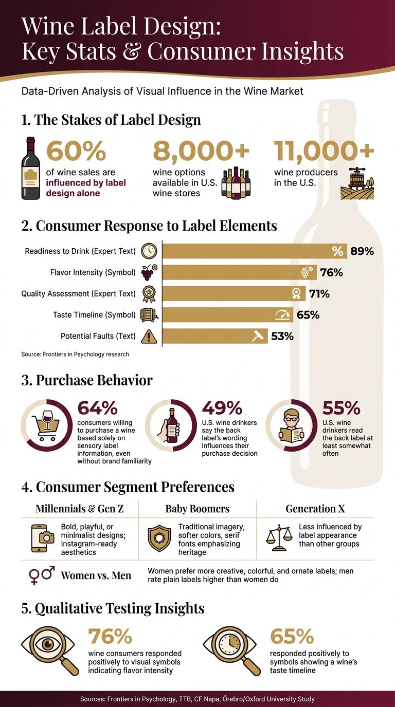
Wine labels are more than decoration - they’re a brand’s first impression, influencing 60% of wine sales through design alone. With over 8,000 options in U.S. wine stores, labels must stand out and communicate quality instantly. This article explores how design elements like typography, color, and layout shape consumer decisions, why testing is critical for label success, and how compliance with U.S. regulations ensures market readiness.
Key highlights:
Typography sets the tone, from heritage serif fonts to modern sans-serif styles.
Color choices signal price and flavor, with bold hues for under $20 wines and subdued palettes for premium bottles.
Testing methods like focus groups, surveys, and eye-tracking validate designs for retail and digital environments.
Regulatory compliance ensures labels meet U.S. Alcohol and Tobacco Tax and Trade Bureau standards.
Wine Label Design: Key Stats & Consumer Insights
Core Elements of Effective Wine Label Design
Typography, Color, and Layout
Typography does more than convey information - it shapes the brand's personality. Label designer Chuck House explains it well:
"Your fonts are more or less a tone of voice that sets a mood: you get it immediately."
Traditional wineries often lean toward serif and script fonts to highlight heritage and craftsmanship. In contrast, modern brands may choose bold sans-serif fonts paired with generous white space to project a fresh, approachable vibe. Whatever the choice, the font should align with the brand's identity and appeal to its target audience.
Color choices also play a crucial role. For instance, deep, rich tones on a red wine label can evoke a sense of complexity, while lighter blues and greens on a white wine label suggest a crisp, refreshing experience. Pricing can also influence color schemes - wines under $20 frequently use bright, attention-grabbing hues like red, orange, and gold, while more expensive bottles often favor understated, classic palettes.
The layout ties everything together. A well-designed label considers the bottle as a whole, ensuring the label, bottle shape, and capsule work in harmony. Minimalist layouts are increasingly popular for their clean and confident look, but designers must ensure the design remains functional on the bottle's curved surface. Reviewing mockups on actual bottles early in the process can help catch issues that a flat design might miss. And, of course, compliance with U.S. regulatory standards is non-negotiable.
US Regulatory Requirements for Wine Labels
In the U.S., wine labels must meet federal standards set by the Alcohol and Tobacco Tax and Trade Bureau (TTB) under 27 CFR Part 4. These rules apply to wines with alcohol content between 7% and 24% by volume. Before any bottle hits the shelves, producers or importers must secure a Certificate of Label Approval (COLA) - Form TTB F 5100.31 - to confirm compliance.
Mandatory label elements fall into two categories: those required on the brand label and those that can appear on any label on the bottle.
Mandatory Element | Required Placement |
|---|---|
Brand Name | Brand Label |
Class or Type Designation | Brand Label |
Appellation of Origin (if applicable) | Brand Label |
Alcohol Content | Any Label |
Net Contents | Any Label |
Government Health Warning | Any Label |
Sulfite Declaration | Any Label |
Name and Address of Producer/Bottler | Any Label |
Notably, the sulfite declaration is only mandatory if the wine contains 10 parts per million (ppm) or more of sulfur dioxide. The government health warning must also meet specific type size and legibility standards under 27 CFR Part 16 - it cannot be tucked away in tiny print.
Once the design and compliance aspects are in place, the next step is to weave imagery and storytelling into the label's narrative.
Using Imagery and Narrative to Tell a Brand Story
Imagery transforms a wine label from functional to unforgettable. Whether it’s an estate illustration, custom artwork, or even street art, visuals help anchor a brand's identity. For example, a hand-drawn vineyard sketch might evoke a sense of tradition and place, while bold, abstract designs could signal innovation and adventure.
Patti Britton of Britton Design sums it up perfectly:
"Wine packaging is like a mini-poster, allowing only a few seconds to communicate a story. Impressions move from the eye to the mind to the heart."
Tactile details also contribute to the story. Techniques like embossing, foil stamping, or using specialty papers create a physical connection, encouraging shoppers to pick up the bottle - a crucial step toward purchase. These elements are especially effective for premium wines, where touch reinforces the perception of quality.
Digital features can take engagement even further. QR codes or augmented reality (AR) elements can link consumers to digital content like virtual vineyard tours, food pairing tips, or winemaker insights. This approach keeps the label visually clean while offering curious buyers a deeper dive into the brand.
Methods for Testing Wine Label Designs
With over 11,000 wine producers in the U.S. and the average wine superstore offering more than 8,000 different bottles, nailing the right label design is critical. Below, we’ll explore qualitative, quantitative, and digital testing methods that can help refine wine labels from concept to shelf.
Qualitative Testing: Focus Groups and Interviews
Focus groups and one-on-one interviews are excellent tools for understanding why consumers respond to a label in a certain way. These sessions provide insights into how people interpret colors, symbols, and language, helping you align the label with your brand identity.
This method is particularly useful for testing creative or unconventional design elements. For example, a study by Örebro University and Oxford University revealed that visual symbols indicating flavor intensity resonated with 76% of wine consumers, while symbols showing a wine’s taste timeline received positive feedback from 65% of participants.
"Traditional designs may not inherently convey the intricate nuances of a wine's sensory properties to the discerning consumer." - Anders Crichton-Fock et al.
By using these qualitative insights, you can ensure that visual cues accurately reflect the wine’s profile. For instance, a label suggesting sweetness for a dry wine could lead to consumer disappointment and hurt repeat purchases.
Quantitative Testing: Surveys and Eye-Tracking
Once you’ve gathered in-depth feedback, quantitative methods like surveys and eye-tracking can validate your design choices on a larger scale. Surveys are particularly effective for measuring purchase intent, gauging how well sensory symbols communicate, and segmenting responses by factors like demographics or wine expertise. A study of 329 wine consumers found that 64% were willing to purchase a wine based solely on sensory information, even if they weren’t familiar with the brand.
Eye-tracking takes things a step further by pinpointing exactly where consumers focus their attention and for how long. Dr. Chengyan Yue explains:
"Eye tracking uses equipment to capture participants' eye movements, eye position, or pupil size. It can be used to determine how long someone looks at a packaging attribute or how much time it takes them to find an attribute for the first time."
In March 2023, Dr. Yue’s team used eye-tracking to study how consumers interact with information-heavy wine labels. They identified the point where too much detail begins to overwhelm decision-making. For designers, this means that placement is key - eye-tracking heat maps can help you position important elements, like awards or quality ratings, where consumers naturally look first.
The table below highlights consumer responses to various label elements based on research from Frontiers in Psychology:
Label Element | Consumer Positive Response |
|---|---|
Readiness to Drink (Expert Text) | 89% |
Flavor Intensity (Symbol) | 76% |
Quality Assessment (Expert Text) | 71% |
Taste Timeline (Symbol) | 65% |
Potential Faults (Text) | 53% |
Testing Labels in Digital and E-Commerce Channels
A label that shines on a store shelf might not have the same impact when viewed as a small thumbnail on a retailer’s website or a social media ad. This makes digital testing a crucial step in the design process.
Evaluate how the design performs at reduced sizes. Elements like fine fonts, detailed illustrations, and subtle color gradients can lose clarity or impact when scaled down. Testing across different screen sizes and ad formats ensures the label remains effective in digital environments. Research also shows that color factors, such as brightness and contrast, have a stronger influence on perceived value and consumer ratings than layout features like the rule of thirds. This is especially important in online settings, where first impressions are made in a split second.
Tailoring Wine Labels for US Consumer Segments
Segmenting US Consumers by Label Preferences
Wine labels are far from one-size-fits-all. Different generations and demographics respond to distinct designs, and understanding these preferences can make all the difference. Millennials and Gen Z lean toward bold, playful, or minimalist designs that feel genuine and Instagram-ready. Meanwhile, Baby Boomers value label appeal just as much but prefer traditional imagery, softer color schemes, and serif fonts that emphasize heritage and sophistication. Generation X, however, places less importance on label appearance compared to the other two groups.
Gender also adds another layer of nuance. According to Professor Marianne McGarry Wolf:
"Women preferred more creative, colorful, and ornate wine labels than men did. Similarly, women rated plain, less colorful logos lower in attractiveness than men did."
For premium wines, design elements like gold foil, embossing, and elegant script fonts suggest luxury and exclusivity. On the other hand, casual drinkers are drawn to bright, approachable graphics and clear, easy-to-read text. Typography matters: serif fonts evoke a sense of tradition and elegance, while bold sans-serif fonts appeal to a modern, contemporary audience.
The back label is often overlooked but plays a pivotal role in consumer decisions. Nearly half (49%) of US wine drinkers say the back label’s wording influences their purchase, and 55% read it at least somewhat often. What do they look for? Clear descriptions of flavor and aroma. As Wolf explains, "Consumers simply want to know what to expect from the wine", rather than a detailed history of the winery.
These preferences underline the importance of designing labels that not only catch the eye but also communicate sensory details effectively. Aligning design with consumer expectations ensures labels resonate with their intended audience.
Using Multisensory Cues on Labels
To go beyond aesthetics, wine labels can incorporate multisensory cues that help consumers predict the wine's taste and profile. These cues, often referred to as crossmodal cues, translate sensory information into visual elements that are easy to grasp.
Symbols like flavor intensity icons or indicators for taste evolution provide practical, actionable insights for buyers. As researchers from Frontiers in Psychology explain:
"Visual crossmodal communication [is] a promising pathway capable of skillfully capturing consumer attributes, conveying multisensory experiences, and portraying the comprehensive timeline of taste evolution."
For designers, adding simple yet effective icons - such as those for bitterness levels or flavor profiles - can instill confidence in shoppers. This is especially helpful in crowded wine aisles, where making a quick decision without expert guidance is often the norm. By blending design with functionality, these labels make the shopping experience smoother and more intuitive.
Refining Wine Label Design Over Time
Incremental Updates vs. Full Redesigns
Not every wine label update calls for a complete overhaul. For well-established brands, making subtle, thoughtful adjustments often works better than starting from scratch. As David Schuemann, President of CF Napa, explains:
"The larger the brand, generally the smaller the changes that can be made responsibly."
These smaller, evolutionary updates might include switching to a serif typeface, tweaking the color of a brandmark, or upgrading to a higher-quality paper stock - all while maintaining the label’s familiar look. On the other hand, revolutionary redesigns involve a complete transformation of the label’s identity, which can be risky. A cautionary example is Smoking Loon, which saw a sharp decline in sales and lost its market position after a bold redesign in 2006.
A useful method for refining a label is the "subtraction" approach. By removing elements one at a time, brands can identify which components are essential for maintaining recognition. If the logo and brand name are strong, there’s often more room for subtle adjustments.
After making changes, it’s important to test and gather customer feedback to ensure the updates resonate with the target audience.
Testing and Launching New Label Versions
Once the scope of the label update is decided, thorough testing becomes critical. Pre-launch testing can help predict how the market will respond. Take Hahn Family Wines as an example: when redesigning its "SLH" tier for the 2012 vintage, they worked with CF Napa to highlight the "SLH" initials prominently and used color-coded capsules - burgundy for Pinot Noir and gold for Chardonnay. This redesign, which took seven months to complete, received positive feedback from trade professionals.
Another essential step is the physical press check. Digital proofs and foil swatches often differ from the final printed product, making this step the last chance to catch issues like color shifts or inconsistencies in materials. CF Napa typically advises brands to allow for a three-month planning period before starting redesign work. This ensures there’s enough time to craft a clear strategy and brand story.
Tracking Performance After a Label Launch
The work doesn’t stop once a new label hits the shelves. Ongoing performance tracking is key to ensuring the changes continue to connect with consumers. Monitoring specific metrics can help determine whether the update is successful or needs further refinement.
Metric Category | What to Track | How to Measure It |
|---|---|---|
Sales Impact | Sales lift by channel | Depletion reports and retail scanner data |
Brand Recognition | Consumer recognition and recall | Focus groups and eye-tracking studies |
Perceived Value | Ability to sustain price increases and quality perception | Consumer surveys and tasting room feedback |
Functional Utility | Ease of identification in storage and on-premise racks | Distributor and sommelier interviews |
A great example of effective performance tracking is Sierra Nevada Pale Ale’s packaging refresh. When Auston Design Group updated the packaging for the first time in 28 years - modernizing the color palette and re-rendering every element - focus group testing showed that fewer than 10% of loyal customers noticed the change. This demonstrates how an evolutionary update can maintain brand consistency while still refreshing the design.
Feedback from trade professionals is also essential. Distributors and sales teams provide insights on how the label performs in real-world settings, such as dimly lit cellars or crowded store shelves. These insights can highlight practical issues that might not surface in consumer testing.
Conclusion
Why Research-Driven Design Produces Better Labels
As we’ve explored earlier, continuous feedback plays a key role in creating wine labels that stand the test of time. A wine label isn’t just a marker on a bottle - it’s often the first step in convincing someone to make a purchase. Research-driven design allows brands to craft labels that match consumer expectations long before the wine is even tasted. By testing elements like color, typography, and imagery, brands can ensure their labels connect with buyers the moment they spot the bottle. Studies consistently reveal that well-thought-out, detailed labels reduce hesitation and encourage purchases. Sensory cues and expert input are especially powerful in influencing decisions.
Successful wine brands take this knowledge and adapt their designs to reflect shifting consumer preferences, ensuring their labels stay relevant.
Embracing Ongoing Design Evolution
The findings highlight that sticking with a static label design simply doesn’t cut it. Brands that thrive are those that treat label design as a dynamic process, evolving based on consumer feedback. This aligns with the iterative strategies we’ve discussed - whether it’s through small tweaks or complete overhauls, the focus is on maintaining relevance. Illustrator and designer Bob Johnson sums it up perfectly:
"The artist is always beginning. If you are doing it right, the label is really new each time."
Technology is also making it easier for brands to keep their designs fresh. Smart labels equipped with QR codes, augmented reality, or NFC tags allow brands to update their storytelling digitally, without needing to redesign the physical label. By combining digital engagement metrics with traditional sales data, brands gain a clearer understanding of what resonates with their audience.
The strongest wine labels are those that are continuously developed, tested, and refined. Brands that see design as an evolving process - not a one-and-done effort - are the ones that stay ahead in a constantly changing market.
FAQs
How do I choose label typography that fits my brand?
When selecting label typography for your brand, aim for fonts that mirror your brand's personality and narrative. Prioritize readability and choose a style that embodies your core values - whether that's sophistication, tradition, or a modern edge. The typography should harmonize with other design elements and appeal to your target audience, helping you craft a unified and impactful brand identity.
What label colors best match my wine and price point?
Deep shades of red and gold are a natural match for bold, full-bodied wines, especially those with higher price tags. These colors evoke a sense of warmth, opulence, and sophistication, making them perfect for catching the eye of consumers who are looking for a premium, indulgent experience.
Which testing method should I use first?
Start with concept testing to gauge how your target audience responds to initial ideas or label designs. This approach allows you to collect early feedback on elements like design themes, storytelling, and visual appeal. By doing this upfront, you can ensure your wine label connects with consumers before diving into more detailed or expensive testing stages. It’s a smart way to fine-tune your strategy and spark interest right from the start.

Business Growth
Jun 29, 2026
Sell baby products online by leading with safety, clear specs, and parent-proofed reviews to boost conversion and repeat purchases.


