
Typography is more than just choosing fonts - it’s about creating a consistent system that defines how your brand communicates visually. A typographic system ensures consistency across platforms, helps build trust, and enhances readability. Without it, mismatched fonts, inconsistent sizes, and poor layout can confuse users and damage your brand's credibility.
Here’s how to build one in five steps:
Audit Your Current Typography: Identify where and how your fonts are used across all brand touchpoints (e.g., websites, apps, print materials).
Define Requirements: Match font choices to your brand’s personality while ensuring accessibility and scalability.
Select and Pair Fonts: Choose fonts that balance style and practicality, and pair them effectively for hierarchy and clarity.
Build a Hierarchy: Assign clear roles to text elements (e.g., headings, body text) using a type scale and spacing rules.
Test and Document: Test typography across devices and document everything in a style guide for consistency.
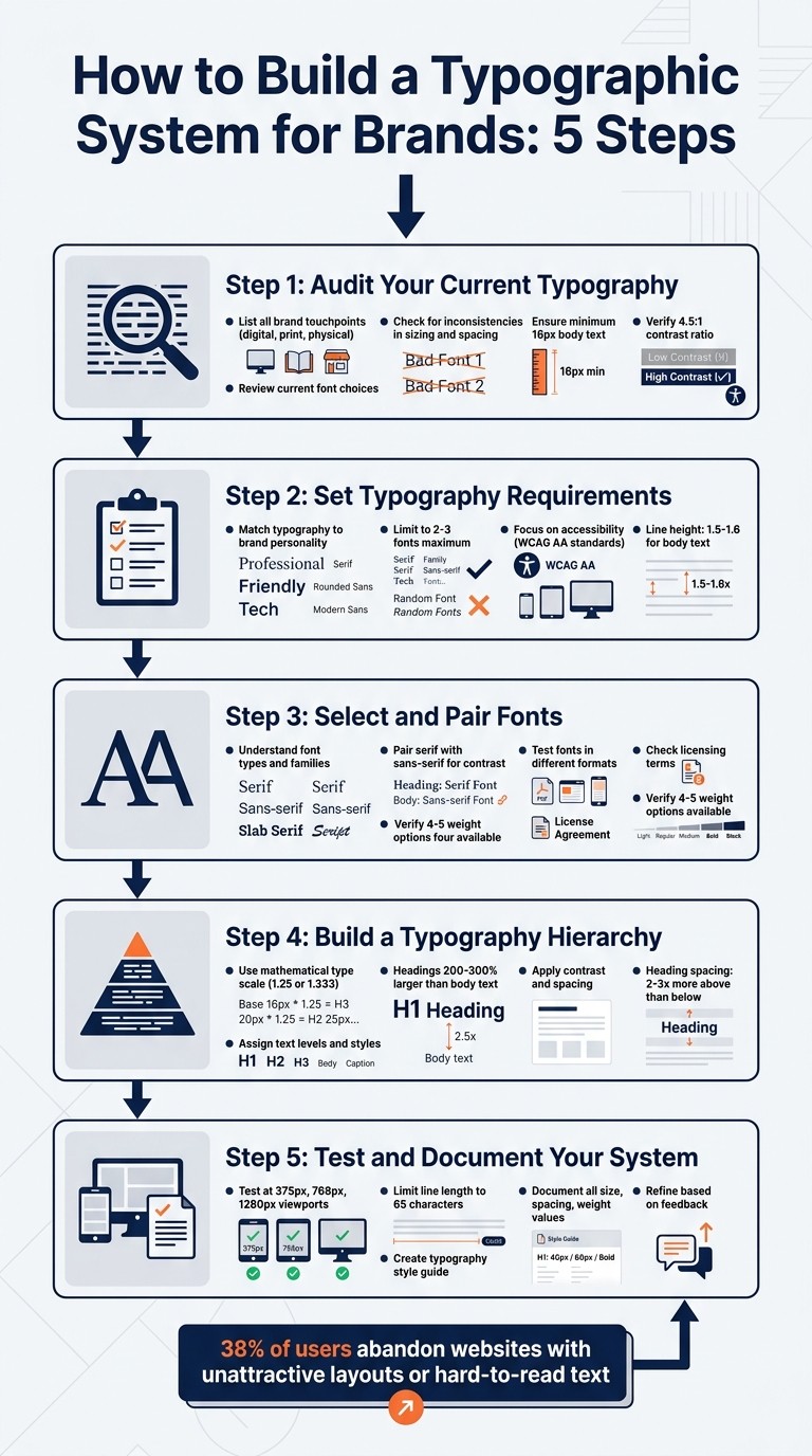
5-Step Process to Build a Brand Typography System
Step 1: Audit Your Current Typography
Before tackling typography issues, it’s crucial to identify every instance where your brand’s typography appears. This means mapping out all the places - websites, apps, emails, social media, digital ads, print materials, and even physical products. Don’t overlook third-party platforms like Instagram stories or Amazon product listings, where consistent branding is equally important. Start by creating a detailed catalog of every instance where your typography is visible.
List All Brand Touchpoints
To ensure no stone is left unturned, build a comprehensive inventory of all the places your text appears. Break it down into categories like digital (websites, apps, emails), print (brochures, business cards), and physical products (labels, packaging). Go beyond general categories like "website" by diving into specific UI elements such as buttons, form fields, navigation menus, modals, and data tables. For physical products, include everything from packaging inserts to shipping labels and shelf displays.
"Typography branding is the judicious selection and implementation of typefaces that visually express your brand's personality, values, and tone across all touchpoints." – Rishabh Jain, Managing Director, Confetti Design Studio
Apple sets a gold standard for typography consistency. It uses its proprietary San Francisco font family across nearly every surface - physical device packaging, user manuals, and digital interfaces like the Apple Watch and iPhone. This unified approach ensures a cohesive brand voice across both hardware and software touchpoints. Once you’ve completed your audit, you’ll need to evaluate how well your fonts perform across these touchpoints.
Review Current Font Choices
Consistency in font usage is essential for building trust and creating a seamless user experience. After listing all your touchpoints, take a closer look at how fonts are being used. Pay attention to subtle inconsistencies like headings sized at 20px in one instance and 18px in another without a clear reason. Check if there’s enough distinction between headings and body text; if they’re too similar in size or weight, it can make content harder to read and scan.
Spacing is another critical factor. Line heights that are too tight can make text feel cramped, while overly loose spacing can make long sections of text difficult to follow. For accessibility, ensure body text is at least 16px and meets a contrast ratio of at least 4.5:1 against the background. Lastly, confirm that all commercial fonts are properly licensed to avoid legal issues.
Step 2: Set Typography Requirements
Once you’ve finished your audit, the next step is to establish clear guidelines for selecting fonts that align with your brand and technical needs.
Match Typography to Brand Personality
Typography plays a pivotal role in communicating your brand’s identity. The fonts you choose can set the tone for how your audience perceives your brand - before they even read a single word.
"Your font choices shape how people perceive your brand before they read a single word." – Ihor Kirpichnikov
Start by identifying your brand’s core traits. If your brand leans toward formality and authority, consider classic serif fonts like Baskerville or Caslon, which convey trust and tradition. On the other hand, if you’re aiming for a sleek, modern vibe, geometric sans-serifs like Futura or Montserrat are great options. A good example of this in action is Mailchimp’s rebrand, which combined a playful serif (Cooper Light) with a clean sans-serif to make the brand feel both approachable and professional for small businesses.
Stick to a limited font palette - two or three fonts at most. Use one font for bold, personality-driven elements like headlines, and another for body text to ensure readability. You can create visual hierarchy by varying the weights within the same font family, which keeps the design cohesive and avoids unnecessary clutter.
Once you’ve aligned your typography with your brand’s personality, it’s time to consider the technical aspects.
Focus on Accessibility and Scalability
Aesthetics are important, but your typography also needs to function seamlessly across devices and meet accessibility standards. For body text, a minimum size of 16px ensures readability and reduces the need for users to zoom on smaller screens.
Color contrast is another critical factor. To meet WCAG AA standards, aim for a contrast ratio of at least 4.5:1 for regular text and 3:1 for larger text. Fonts with a large x-height and open counters (like the openings in letters such as “e” or “a”) improve legibility, especially at smaller sizes. Additionally, ensure your typefaces support the necessary character sets - such as Extended Latin, Cyrillic, or Greek - if your brand has a global audience.
Line height also plays a key role in readability. Body text typically benefits from a line height between 1.5 and 1.6, while larger headings may work better with tighter spacing, around 1.1 to 1.3. For consistent scalability, consider using rem units and a mathematical type scale with ratios like 1.250 or 1.333. This approach ensures your typography remains visually balanced across different screen sizes.
Step 3: Select and Pair Fonts
With your requirements set, it's time to choose the fonts that will anchor your typographic system. This step is all about finding the sweet spot between style and practicality.
Understand Font Types and Families
Your main font plays a big role in defining your brand’s personality. It’s usually featured in headlines and key messaging. Display fonts, with their bold contrasts and tighter spacing, are perfect for making a statement at larger sizes. On the other hand, text fonts are designed for readability, with more generous spacing that works well for long-form content.
Different font categories also evoke certain feelings. For instance, serif fonts often convey tradition, trust, and authority, making them great for industries like law, finance, or luxury. Sans-serifs, on the other hand, are sleek and modern, often used by tech companies and startups. Script fonts bring a touch of elegance and creativity but are best used sparingly, as they can be hard to read. Display fonts, with their bold and unique designs, are built to grab attention in headlines.
For brands that operate primarily online, functionality is just as important as style. Your primary font should offer a range of weights - ideally four or five - and maintain clarity at all sizes, especially smaller ones common in digital interfaces. Don’t forget to check the font’s licensing terms to ensure it covers all your needs, like web embedding, mobile app use, and redistribution for white-label systems.
These distinctions will help you make informed choices and set the stage for effective font combinations.
How to Pair Fonts
A classic pairing approach is to combine a serif with a sans-serif. The contrast between the two creates a striking visual hierarchy. Typically, the display font brings the personality, while the text font works quietly in the background, providing readability for body copy.
"Too close for comfort." - Ellen Lupton, Typographer and Author
When pairing fonts, aim for distinct roles. Avoid fonts that are too similar, as they can create visual clutter. Instead, look for fonts with shared characteristics - like similar x-heights or stroke contrasts - to maintain a cohesive look.
Keep your font palette simple. Stick to two or three fonts per project. You can create additional layers of hierarchy by using different weights within the same font family, rather than introducing more typefaces.
Test Fonts in Different Formats
Once you’ve paired your fonts, it’s time to see how they perform in real-world scenarios. Don’t just test them on a large desktop screen - what looks sharp on a 27-inch monitor might not hold up on a 5-inch phone display. Use actual brand content, like headlines, body text, and calls-to-action, to ensure the fonts work well with special characters, numbers, and varying word lengths.
A good way to test your body font’s readability is the "Terms of Service" test. Try reading a dense page of text at 16px on a mobile phone. If you notice the font more than the content, it’s probably too complex. Also, check your font pairings on various backgrounds - white, dark, colored, or even over images - to ensure consistent legibility across all your marketing materials.
Lastly, confirm that the font family has enough weight options and that the differences between them are noticeable, even at smaller sizes. Since each weight adds to the file size (usually 20–80 KB per file), limiting your choices to essential weights like Regular and Semibold can help improve page load times while keeping your design functional and accessible.
Step 4: Build a Typography Hierarchy
After choosing and pairing your fonts, the next step is to organize them into a clear visual system. A well-structured typography hierarchy helps readers quickly identify key content. Without it, even the best font choices can fall flat.
This hierarchy ensures all text elements work together to create a consistent brand voice while building a scalable and cohesive typographic system.
Assign Text Levels and Styles
Each text element should have a distinct role. To achieve this, use a mathematical type scale (like 1.25 or 1.333) for font sizing instead of random values. These ratios create a sense of balance and harmony, making your design feel purposeful. For example, starting with a 16px base size and applying a 1.25 scale generates sizes that naturally separate headings from body text.
Start by setting the body text size - 16–18px is a common choice for web content - and scale all other text elements from there. Assign specific fonts, sizes, and weights to different roles, such as:
Display: For hero sections or standout elements.
Headline: For page titles.
Title: For section headers.
Body: For main content.
Label: For UI elements like buttons.
Stick to numeric font weights (e.g., 400 for regular, 700 for bold) to maintain consistency across platforms.
"If everything is bold, nothing is bold. If everything is large, nothing is large. Restraint is what makes hierarchy work." - FontFYI
When creating headings, aim for sizes 200–300% larger than the body text. Subtle increases, like 20%, won’t provide enough contrast to establish importance. Limit yourself to 2–3 font families and use variations in weight within those families to create additional layers of hierarchy instead of introducing more typefaces.
Once sizes and weights are in place, focus on refining contrast and spacing to create a polished look.
Apply Contrast and Spacing
With text roles defined, use contrast and spacing to strengthen the hierarchy.
Contrast is key to drawing attention. Larger text sizes naturally grab focus, making them ideal for H1 titles. Weight is another tool - smaller, bold text can stand out just as much as larger, thinner text. Color also adds depth: high-contrast colors like black or dark gray highlight primary content, while lighter shades like gray can subtly indicate secondary details, such as timestamps.
Spacing plays an equally important role. The Law of Proximity suggests that headings should have 2–3 times more space above than below to visually connect them with the content that follows. For line height, stick to 1.5–1.6 for body text to enhance readability, and tighten it to 1.1–1.3 for large headings to maintain their visual impact.
Finally, run a Squint Test: squint at the design to check if key elements like H1s and CTAs stand out. If everything blends together, it’s a sign that your contrast or spacing needs adjustment. This simple trick ensures your hierarchy is doing its job effectively.
Step 5: Test and Document Your System
Testing your typography across all brand touchpoints is crucial. A system that looks great on a desktop but falls apart on mobile is a common issue in design execution.
Test for Responsiveness
Start by testing your typography at three key viewport widths: 375px (mobile), 768px (tablet), and 1,280px (desktop). If you're using CSS clamp() for fluid scaling, be sure to test continuously, not just at breakpoints, to catch any scaling inconsistencies.
Testing on actual devices is essential to confirm readability. Apply your typography to a variety of UI components to ensure it performs well in both dense and open layouts.
A quick trick: squint at your screen to check if headings and CTAs still stand out through size, weight, and contrast. On mobile screens, where size differences are less obvious, you might need to bump up font weights (e.g., from 600 to 700) and add more vertical spacing to clearly separate headings from body text.
For optimal readability, limit line lengths by setting max-width: 65ch on text containers. This keeps lines between 45 and 75 characters, which is the sweet spot for comfortable reading. Also, confirm that your fonts support extended Latin characters and any other language sets your brand may require.
Once you've verified everything works seamlessly, document your decisions.
Create a Typography Style Guide
Documenting your typography system ensures consistency and makes it easy to replicate. Your style guide should include:
Typeface selection and font stacks (primary, secondary, and fallback)
Exact size values for different text roles (like H1, H2, body, and captions)
Spacing rules such as line height and letter spacing for each element
Here's an example of how to structure this information:
Use semantic naming based on the text's purpose (e.g., "Title" or "Label") rather than describing its appearance (like "24px Bold"). This approach allows for responsive adjustments while maintaining a clear structure.
Don’t forget to document channel-specific rules, such as the minimum font sizes for print (8pt) versus mobile screens (16px). Also, include approved color pairings that meet accessibility standards, like a 4.5:1 contrast ratio for body text and 3:1 for large text (defined as 18px regular or 14px bold and above).
To bridge the gap between design and development, map typographic styles to design tokens (e.g., $font-size-body). Additionally, include details like commercial licenses, font sources (e.g., Google Fonts or Adobe Fonts), and character set requirements for localization.
"The most disciplined brand type systems use fewer fonts more precisely, not more fonts more freely." - Bettermockups
Refine Based on Feedback
Your first draft won't be flawless, and that's okay. Work with brand and marketing teams to ensure your typography reflects your brand's personality - whether that's playful, elegant, or bold. Collect feedback from users and stakeholders to identify any issues with readability or navigation.
Create a role inventory by listing every type of text your brand uses, such as H1s, subheadings, button labels, and captions. This will help ensure your system accounts for all scenarios. Watch for visual inconsistencies, like mismatched line heights or arbitrary font size changes (e.g., using 18px in one spot and 20px in another without a clear reason).
If your brand involves physical products, test your typography on different materials, such as matte and glossy surfaces, or even curved ones. Ink spread and texture can impact legibility. Regularly review new brand assets to catch any ad-hoc styles designers might be creating, which could indicate your system needs more flexibility.
Keep in mind that 38% of users will abandon a website if the layout is unattractive or the text is hard to read.
Conclusion
Benefits of a Strong Typographic System
A thoughtfully crafted typographic system does more than enhance your brand's aesthetics - it creates consistency effortlessly, shaping how users perceive and interact with your brand across every platform, from websites to product packaging. In fact, your typography can become so distinctive that users recognize your brand without even needing to see your logo - your type becomes your visual "voice" [29, 9].
The practical advantages are just as impactful. Designers and developers save time by relying on a shared framework rather than making individual decisions for every new project. This shared "language" eliminates guesswork, streamlines workflows, and scales seamlessly - whether you're introducing a new product or entering a new market, your system adjusts without requiring a complete overhaul [1, 5].
From a user perspective, clear typographic hierarchy and improved readability make content easier to scan and navigate. This boosts cognitive fluency, which is the ease of processing information, leading to increased trust and a stronger connection with your brand. Research even suggests that serif fonts can enhance perceived credibility by as much as 18%.
These advantages lay a solid foundation for creating your own typography system.
Getting Started
Ready to build your system? Follow the five steps outlined in this guide: audit your current typography, define clear requirements, choose and pair fonts thoughtfully, establish a hierarchy, and rigorously test your system. Begin with your most prominent assets, like your website and key marketing materials, before rolling it out more broadly.
"Most typography systems don't fail because the fonts are ugly; they fail because they lack a solid logic chain."
Ilya Greben, Founder of Design Systems Surf
The key is to establish a strong foundation. Use a mathematical type scale, limit yourself to two or three font families, and document every decision in a style guide that's easy to access. While building a system requires upfront effort, the long-term rewards - consistency, efficiency, and brand recognition - are well worth it.
FAQs
How many fonts should a brand typography system use?
A brand's typography system usually incorporates two to three fonts to establish hierarchy and maintain uniformity. Sticking to this number is a common recommendation to prevent visual clutter. For most projects, using just two fonts works well - one for headlines or display text and another for body text. This keeps the design clean and consistent.
What type scale should I pick for headings and body text?
A type scale ratio between 1.25 and 1.5 works well to establish a clear visual hierarchy. For headings, stick to the larger end of this range to make them stand out. Meanwhile, keep body text smaller and uniform to ensure it's easy to read. This approach creates a balanced and consistent typography system that aligns with your brand's identity.
How do I turn typography styles into design tokens for developers?
To build design tokens from typography styles, start by defining reusable variables for key font attributes such as font family, size, weight, line height, and letter spacing. Use a clear and consistent naming convention, like typography-heading-large, to make them easy to identify and apply. Store these tokens in a central format, such as JSON or YAML, to ensure they can be easily managed and shared. It's crucial to integrate these tokens into your design system, making them accessible to developers to maintain consistency and scalability across all platforms.
Related Blog Posts

uncategory
Apr 21, 2026
align-brand-voice-with-audience


