Packaging design trends 2027 will be judged in seconds, not minutes. With a graphic refresh often taking 3 to 6 months and a structural redesign 12 to 18 months, brands that wait too long risk missing their 2027 launch window. The core problem is simple: packs now have to sell on a store shelf and in a small online thumbnail at the same time. This guide breaks down what matters most, which design moves are gaining ground, and how CPG brands can test concepts before they spend on print, tooling, or retailer rollout.
TL;DR
Packaging design trends 2027 point to packs that are read fast, show value fast, and sort variants with little effort.
Shelf impact now depends on both CPG packaging design and e-commerce visibility, since many products are first seen on a phone screen.
Material choice, shape, bold type, and proof on-pack matter more than extra copy or decorative layers.
Graphic updates often take 3-6 months, while structural pack changes often take 12-18 months.
Early concept testing with category buyers can cut launch risk before brands commit money to tooling or a full print run.
What Does Shelf Impact Really Mean for CPG Packaging in 2027?
In 2027, shelf impact means winning both the aisle and the thumbnail. Packaging has to read fast on a crowded shelf and still make sense as a tiny image on a phone screen. That shift changes the job. A pack now needs to stop a shopper in person, hold its shape in an ecommerce grid, and signal value in seconds. The ten trends below show how brands are turning that brief into shelf impact.
What Are the Top 10 CPG Packaging Design Trends Shaping Shelf Impact in 2027?
CPG packaging design trends in 2027 are being shaped by split-second shopping decisions, tougher demands around materials, and packaging that has to work just as hard on a phone screen as it does on a retail shelf. The ten trends below show where shelf impact is heading and why certain formats are pulling ahead. The table gives a quick scan of each trend, its best use case, its main shelf effect, and the consumer trigger behind it.
Trend | Best Use Case | Primary Shelf Effect | Consumer Trigger |
|---|---|---|---|
Minimalist Shelf Signal | Premium & organic foods | Clean, low-noise shelf presence | Sustainability & purity |
Tactile Premium Materials | Luxury spirits & gourmet snacks | Sensory engagement through touch | Premiumization |
Bold Typographic Packaging | New brand launches & snacks | Instant brand recognition | Clarity & honesty |
Heritage-Led Modernization | Craft beverages & legacy brands | Nostalgic yet contemporary appeal | Authenticity |
High-Contrast Color Blocking | Energy drinks & functional beverages | High-speed visual capture | Energy & excitement |
Sustainable Material Cues | Household goods & daily staples | Eco-friendly materials and recyclability cues | Eco-consciousness |
Transparent Product Storytelling | Seafood, meat & produce | Trust through traceability | Food safety & ethics |
Structural Differentiation | On-the-go snacks & drinks | Unique silhouette recognition | Convenience & portability |
Digital-Ready Packaging | E-commerce & direct-to-consumer | Seamless physical-to-digital link | Tech-savvy convenience |
Limited-Run Collectible Design | Seasonal items & influencer collabs | Scarcity & collectibility | Exclusivity & FOMO |
Two patterns stand out across these ten directions. First, sustainability has shifted from a niche preference to a core shelf expectation. Second, connected tools such as QR codes and NFC are becoming a normal part of the pack. Slim cans and stand-up pouches are also gaining ground because they support portability, visibility, and shelf stability at the same time. For brands planning 2027 refreshes with a CPG marketing agency, the smartest place to start is with the trends that fit the category and the way shoppers actually buy.
How Does Minimalist Packaging Design Speed Up Recognition on a Crowded Shelf?
Minimalist shelf signal wins by reducing scan time. On a crowded shelf, shoppers do not study every label. They skim, compare, and move on. That is why minimalist packaging design can outperform busier packs: it helps the eye find the product faster. Strip out the extra noise first, and let typography, color, structure, and materials do the heavy lifting.
Graza is a useful example of this approach. The pack reads faster, which helps it stand out in crowded sets and in thumbnail views. That matters most in categories where shoppers compare near-identical products side by side.
Minimalism only works when the pack has a digital layer to carry the missing detail. QR codes and NFC can shift nutrition, instructions, and brand storytelling off-pack, which keeps the primary panel clean.
The cut should happen in this order: claims, decorative art, then secondary copy. That sequence keeps the system feeling deliberate rather than empty. When done well, the pack does not look cheap or unfinished. Instead, the structural format and material quality send the premium signal that copy once tried to carry.
How Do Tactile Premium Materials Signal Quality Before a Shopper Reads the Label?
If minimalist packaging wins on speed, tactile premium materials win on perceived quality. Shoppers often make a call in seconds, and material cues shape that call before any headline, ingredient list, or brand story gets a chance. Weight, surface texture, and finish all send fast signals about what kind of product is in hand.
Glass is the clearest case. It is inert and often reads as a purity cue for high-value products. Borosilicate and molded glass add a stronger, more protective feel, which can deepen that quality impression. Aluminum sends a different message. Its cool, rigid surface suggests durability and a higher-end build. Evian used both ideas when it launched Evian Sparkling in aluminum cans and recycled PET bottles.
The strongest material systems keep the logic simple: put investment into what shoppers touch first. Cutting weight and finish too early can weaken the first impression. In many cases, a cleaner, tougher material system creates more shelf impact than adding extra graphics.
Once material cues do the heavy lifting, typography can deliver the next layer of shelf impact.
How Does Bold Typographic Packaging Cut Through Visual Noise at Shelf?
Once material choice signals quality, typography has to earn the first look. Bold typographic packaging turns the pack itself into the brand message. Oversized, high-contrast type helps shoppers grasp the brand and product value fast, which matters when purchase choices happen in seconds. This type-led approach works best when letterforms, weight, and scale feel expressive enough to act as part of the brand system, not just a label.
Printing gains have made this route more practical on aluminum cans and flexible pouches, where bright graphics can stay crisp and easy to spot. That helps explain why slim cans, tallboys, and stand-up pouches can deliver shelf impact: they give typography more space to do its job. Wild Planet offers a clear example. Its Limited Edition Wild Tuna Snack Pack used direct typographic cues to spotlight both the partnership and the product’s high-protein positioning, carrying both messages in a single glance.
Shoppers tend to reward packs that communicate right away. Bold type can also signal a more upscale feel by putting ingredients or brand story front and center. The tradeoff is readability. Oversized typography can crowd required claims and make the pack harder to scan. When a brand needs to share more detail, QR codes or NFC tags can shift the longer story off-pack while keeping the front panel clean and type-forward.
For brands planning a packaging and identity systems refresh ahead of 2027, bold type tends to work best in categories packed with visual clutter, where fast recognition has more payoff.
How Are Brands Updating Legacy Packaging Without Losing Shelf Recognition?
Some 2027 packaging updates do not need a new visual system. They need a tighter, cleaner version of what shoppers already know. Heritage-led modernization keeps the shelf cues that trigger instant recognition, then updates the pack just enough to feel current. Recognition comes first. Refresh comes second.
That usually means keeping the shape, proportions, and main color system in place, then improving materials, finishes, or print quality. The goal is simple: protect what shoppers spot in a split second while removing details that feel dated.
Bumble Bee Foods gave a clear example in September 2024 when it launched a line of single-serve, ready-to-eat canned tuna products. The packaging introduced recyclable materials and new flavor options while keeping the recognizable Bumble Bee branding in place. The format shifted, but the trust cue stayed.
Modern printing also gives legacy brands more room to update without starting over. It can sharpen existing layouts, improve color consistency, and clean up older pack designs without changing their basic structure. That helps brands keep instant shelf ID while making the package feel newer, not unfamiliar.
For 2027 refreshes, the smart move is to separate the cues that drive recognition from the habits that do not.
How Does High-Contrast Color Blocking Help Shoppers Navigate a Product Line at First Glance?
If heritage-led modernization protects recognition, high-contrast color blocking helps shoppers move through a product line fast. One color field can signal each flavor, formula, or size, so the right variant stands out at a glance. That matters most when a brand sells many options and the system needs to hold up on crowded retail shelves and in packed ecommerce grids.
Once the color code is in place, the rest of the layout should stay fixed. Keep the logo area in the same spot, maintain the same core structure, and let color handle the sorting. That simple move cuts friction. A shopper does not need to relearn the package from one SKU to the next; the eye spots the color, reads the variant, and moves on.
In practice, this creates a clean visual system across the full line. It also helps protect brand recognition, since the package still looks like part of one family instead of a pile of unrelated designs. On shelf, that kind of consistency can make the difference between a fast grab and a missed sale. Online, it helps product thumbnails read clearly even at small sizes.
How Do Sustainable Material Cues Actually Influence Purchase Decisions at Shelf?
Sustainable material cues shape shelf decisions in seconds. When packaging looks lighter, simpler, and less wasteful, shoppers can spot the sustainability message before reading any copy. That quick read matters. At shelf, the pack itself often does the selling.
A sustainability claim lands harder when the physical package shows the promise, not just states it. Removing secondary packaging, such as plastic shrink-wrap, sends a clear waste-reduction signal. Uncoated textures, recycled-fiber surfaces, and stripped-back structures can signal lower waste and more responsible design at first glance.
Brands are already turning materials into the message. Uflex launched biodegradable pouches while keeping barrier performance. Evian Sparkling shifted to aluminum cans and bottles made mostly from recycled PET as part of its circular-brand push. In both cases, shoppers can see the cue right away. The pack does not ask them to hunt for a claim on the label.
That visual and tactile signal only works when the build backs it up. Lightweight materials and structural shifts can point to lower material use and smart package design. But there’s a catch: if texture, weight, or structure feels out of sync with the sustainability claim, trust can drop fast.
For CPG brands planning a 2027 refresh, the smarter move is to audit what can be removed before deciding what to add. Less wrap. Fewer layers. Simpler structures. Those choices often say more than a badge or icon ever could. Brands can test those cues with category buyers before a full production run.
How Does Transparent Product Storytelling on Packaging Build Buyer Confidence at Shelf?
Transparent product storytelling on packaging can cut shelf hesitation in seconds. When material cues alone do not do the job, proof on-pack makes the claim easier to trust. In categories where sourcing and certification shape the purchase decision, the pack has to do more than look good. It has to show buyers why the product deserves belief.
Transparent storytelling turns the pack into proof, not promise. Front-panel proof lowers doubt fast, especially when shoppers are scanning a crowded shelf and making a call in a few moments.
In March 2024, StarKist launched a line of canned tuna sourced exclusively from responsible fisheries, using the pack itself to signal traceability and certification right at the point of decision. That move shows the core idea clearly: once the front panel proves the product, digital layers can carry the rest.
The front panel should do the heavy lifting on proof. Digital layers can then add sourcing, manufacturing, and freshness details. QR codes and NFC make room for that depth without cluttering the main panel, so the design stays clean while still answering the questions cautious buyers bring to the shelf.
For fresh products, material clarity matters as well. High-clarity PET and transparent windows let shoppers visually verify what is inside, linking the package straight to shelf trust.
How Does Package Shape Create Shelf Recognition That Graphic Design Alone Cannot?
Package shape gives a brand a physical signal that graphics alone can't deliver. When every item on shelf uses the same bottle, pouch, or box, visual design has to work much harder to get noticed. Shape lands first. A shopper sees the form before reading a headline, flavor name, or claim.
Stand-up pouches lead many categories because they improve shelf visibility, stability, and product fit. Carton and board formats often suggest sustainability and premium quality through a clear rectangular profile. Slim and tallboy beverage packs stand out in crowded sets because their silhouette feels more portable and easier to spot.
A clear silhouette also tends to stay in memory faster than color or copy. That memory can shorten the next buying decision. Instead of stopping to compare options again, the shopper often reaches for the shape already linked to the brand. Once the silhouette does that first job, digital packaging can add product details, offers, and changing messages without asking the structure to do everything at once.
For brands investing in packaging and identity systems, structural form can become a long-term brand asset. A structural redesign usually brings more cost, tooling, and production complexity than a label update, so early validation matters. Testing the direction before a full rollout helps reduce risk. After the shape is locked in, digital layers can build on the brand story without changing the silhouette.
How Is Digital-Ready Packaging Changing the Way Brands Win on the E-Commerce Shelf?
A package can look sharp on a store shelf and still fail online. Once shape and color are locked in, the next job is simple: the pack has to win in a thumbnail. In e-commerce, shoppers often see packaging at 200 pixels or less. If the design is hard to read at that size, the sale can disappear before the product page even gets a click.
That shift is changing how brands build packaging systems. Digital-ready packaging has to work in the aisle and on a screen. Brands such as 19 Crimes and Diageo show how connected packaging can stretch the brand story past the label without crowding the front. QR codes, NFC, and RFID move extra detail off-pack, which keeps the front-of-pack clean and helps protect clarity in e-commerce thumbnails and retail media listings.
Online, packs need high contrast, bold type, and one dominant visual that still reads at thumbnail size. The job does not stop at the screen, either. Packaging also has to survive shipping and create an unboxing moment that matches the digital promise. Fast concept testing helps here. Testing two concepts with 200 category buyers in 72 hours can catch online readability problems before production.
Digital-ready systems also fit neatly with limited-run packaging. Short drops paired with digital layers can add urgency and keep product launches feeling timely.
How Do Limited-Run Collectible Packaging Designs Drive Urgency and Trial Faster Than Standard Releases?
Limited-run collectible packaging speeds up trial because the pack signals a short window to buy. When shoppers see something that looks different, temporary, and tied to a specific drop, they are more likely to act now instead of putting the purchase off. In practice, that makes limited-run packaging a sales tactic, not just a design choice.
Shoppers react to these packs because they suggest exclusivity and cut down the pause that often slows a first purchase. The business result is faster trial, not only more awareness.
Wild Planet’s limited-edition Wild Tuna Snack Pack, launched in August 2024 with Simple Mills and Chosen Foods, shows how this works. The collaboration gave the release the feel of a drop: limited, new, and worth trying right away.
A limited run is not just a smaller print order. It is a different go-to-market move. Before launch, brands should test whether the scarcity signal changes buyer behavior in a measurable way.
How Should CPG Brands Plan a Packaging Refresh for 2027?
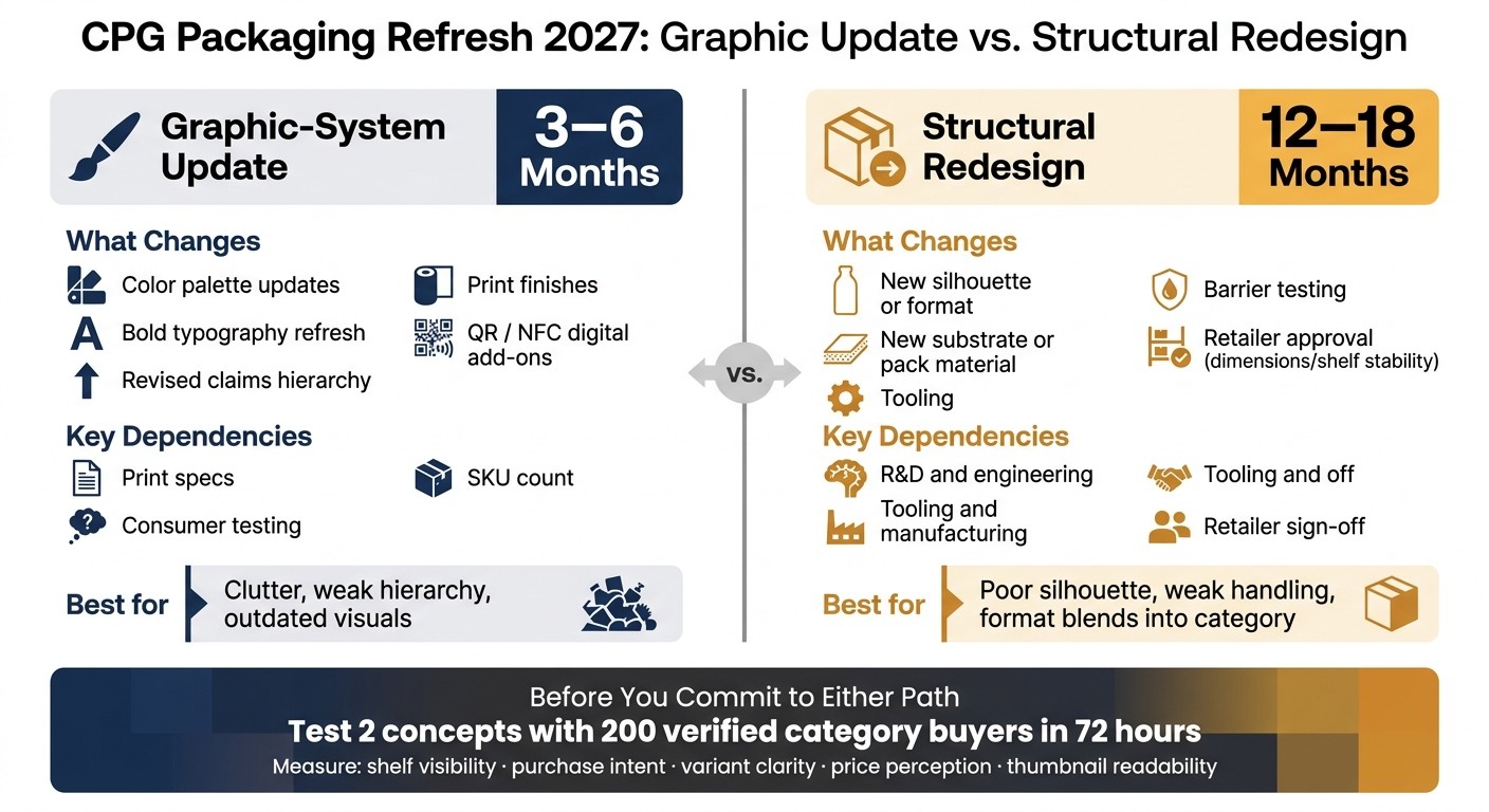
A 2027 packaging refresh lives or dies on one early call: update the graphics or change the pack itself. That choice shapes timeline, cost, testing, retailer review, and launch risk. For most CPG brands, the fastest path to better shelf impact is a graphic-system update. For brands that need a sharper shift in handling, silhouette, or first-touch feel, a structural redesign may do more - but it also takes far longer.
A 2027 packaging refresh usually falls into two paths: a graphic-system update or a structural redesign. The real question is whether shelf impact comes from cleaner graphics or a new physical form.
Graphic updates improve recognition by refreshing the visual layer - color palettes, bold typography, QR codes, NFC tags, and print finishes. This path typically takes 3-6 months from brief to launch.
Structural redesigns change silhouette, handling, and first-touch perception. Changing the package structure requires R&D, barrier testing, new tooling, and retailer approval, so they usually take 12-18 months.
Change Type | Typical Timeline | Key Dependencies |
|---|---|---|
Graphic-system update | 3-6 months | Print specs, SKU count, consumer testing |
Structural redesign | 12-18 months | R&D, tooling, barrier testing, retailer approval |
Set strategy first, then lock the design and retailer requirements before production. For brands with retail distribution, retailer approval is required when package dimensions or shelf stability change - a format shift handled late can delay launch. A CPG marketing agency can build those conversations into the timeline early.
Once the path is clear, validate it with category buyers before committing to tooling or print.
How Can CPG Brands Test Packaging Concepts Before Committing to a Full Refresh?
Before a full packaging refresh goes into production, test the leading concepts with 200 verified category buyers in 72 hours. Using EyeQ, brands can put two designs in front of verified category buyers and get an early read on shelf performance before spending on tooling or print.
That matters because a pack can look good in a review meeting and still miss at shelf. The better question is simple: does the design read fast enough to win the sale?
The test should measure shelf visibility, purchase intent, price sensitivity, and sustainability signal. Those are the signals that separate packaging that looks appealing from packaging that moves product.
Use that read to tighten the brief before final design lock.
Where Do These Packaging Trends Show Up in Real Brand Work?
Shelf impact means very little if it can’t turn into a repeatable brand system. For teams ready to move from trend talk to execution, these three resources show what that looks like in practice.
For the broader brand system behind these packaging decisions, see 2027 design trends that will transform consumer brands. It shows how packaging fits into a larger brand system instead of standing on its own.
For a closer look at how packaging supports fast product recognition, see how packaging communicates flavor. That page breaks down the visual and structural cues - vibrant graphics, slim can formats, and material choice - that help shoppers identify flavor at a glance.
The Luma and Leaf project shows how packaging and identity systems work together in a finished brand system.
What Does Shelf Impact in 2027 Actually Come Down To?
Shelf impact in 2027 comes down to four things: faster brand recognition, clearer variant communication, stronger structural cues, and credible proof of value. Those four factors shape purchase decisions because they help shoppers spot a product fast, understand what version they’re looking at, read the pack form at a glance, and trust what they’re buying.
The ten trends above tie back to these four shelf jobs.
Once that design logic is in place, the next move is to match it to the category and the channel. Stand-up pouches can improve shelf visibility and help packs stay upright at retail. Lightweight flexible formats can work well for e-commerce because they reduce shipping strain in transit. Smart packaging with QR codes can support digital-ready storytelling across channels.
Before a full rollout, validate what shoppers notice first. Test concepts before production to cut rollout risk. That read helps narrow the strongest direction before committing to print or tooling.
If you're weighing a graphic update against a structural change for 2027, talk to Bigeye. Our packaging design team can put your top concepts in front of real category buyers through EyeQ and have results back in about 72 hours.
FAQs
What are the top packaging design trends 2027 for CPG brands?
The main shifts are cleaner front panels, bold typography, high-contrast color systems, stronger material cues, shape-led recognition, connected packaging, and limited-run packaging used to drive trial.
How long does a packaging refresh take?
A graphic refresh often takes 3-6 months. A structural redesign often takes 12-18 months because it may require testing, tooling, and retailer sign-off.
Why does packaging need to work for both shelf and e-commerce?
Many shoppers first see products in a digital grid, not in a store aisle. If the pack does not read well in a small image, the product can lose clicks before the shopper sees the full listing.
When should a brand choose structure over graphics?
A brand should look at structure when the main problem is poor silhouette, weak handling, low pack presence, or a format that blends into the category. If the issue is mostly clutter or weak hierarchy, graphics may be enough.
Do QR codes still matter in packaging design?
Yes. QR codes help move extra detail off the front panel while giving buyers access to sourcing, product use, or brand information when they want more depth.

Branding & Creative
Sep 24, 2026
Brand architecture guide comparing masterbrand, endorsed, and house of brands to cut wasted spend and sharpen buyer choice.